Presidential Cycle Pattern Calls for Choppy October
Free Chart In Focus email
Delivered to you every week
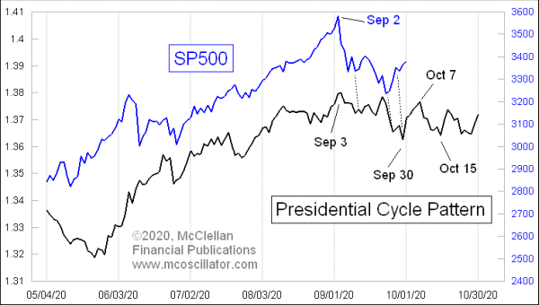
The SP500 has been correlating very strongly with its Presidential Cycle Pattern (PCP) over the past 5 months. It does not always correlate so strongly, so to see this current strong correlation gives greater confidence for how prices should behave forward from here. The key message is that October should see a lot of sideways chop, as it normally does in an election year, as investors worry about the outcome of the upcoming presidential and congressional elections.
One curiousity is that during the month of September, the SP500 seemed to be making its turns about 1 trading day early versus what the PCP indicated. We can live with that, especially when it is such a consistent tendency. So looking forward, that Oct. 15 bottom date shown in the chart may need to be adjusted for that tendency to be slightly early.
I first formulated this Presidential Cycle Pattern back in 1994, and have updated it since. I wanted to have a way to depict graphically the well-known tendency for the stock market to do worse during the first two years of a presidential term, and do better during the final two years.
To build it, I used SP500 data going back to 1928, which I chopped up into 4-year chunks of time starting on Nov. 1 of each election year. I did it that way, rather than Jan. 1, because the stock market typically starts reacting to the election outcome ahead of the actual inauguration day. I also reset each datapoint to reflect the percentage change since each period’s starting point, the better to average them together. Here is what those 4-year chunks looked like:
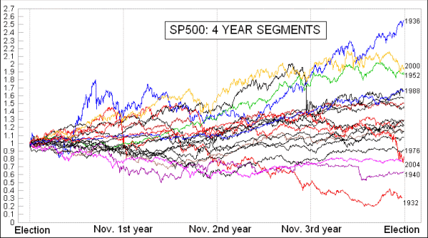
I call that my “Rapunzel” chart, and it is hard to get any useful information from all of those lines. But when we average them together it looks like this:
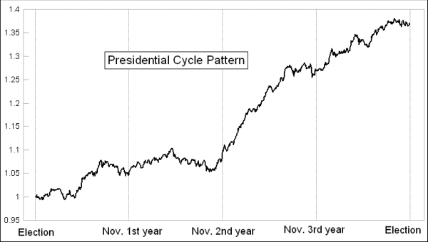
This lets us see that the first two years of each presidential term are indeed more sideways. The third year is typically a very strong year (the stock market is almost never down in 3rd years). The final pre-election year is also up, although not as strongly as the 3rd year, as doubts and worries about the election start to dominate.
Early in President Trump’s term in office, the correlation was really not very strong. Yes, the market did go higher, but the SP500’s correlation to the minor movements of the PCP was poor. I dismissed that at the time in my McClellan Market Report newsletter by noting that everyone seemed to agree that Trump really is a different sort of president.
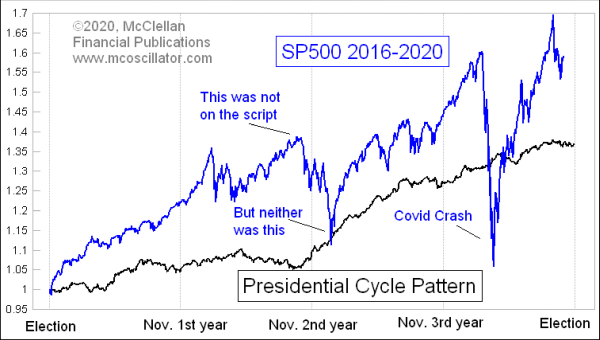
The big decline in Q4 of 2018 was definitely not on the PCP’s schedule. But once that bottom was in, something shifted and the SP500 has been matching the PCP’s minor movements much more closely. The Covid Crash was assuredly not on the program, but prices recovered quickly from that event and have gotten back on track now with what the PCP says. The Sep. 2 SP500 top was almost exactly on schedule, and now the corrective action in Sep. 2020 matches what the PCP says.
Elections offer investors the opportunity to suffer from fear of the unknown. Even if investors could handle any particular actual election outcome, just not knowing makes people feel more fearful, and less willing to commit. We are in that phase now. If the election’s outcome were to suddenly seem to become more clear, via a big shift in the polling data, then investors might start feeling more confident ahead of the actual election, although that possibility seems highly unlikely this time. And the issue of most of the pre-election polling turning out to be wrong in 2016 means that there is less belief in the poll numbers this time.
A choppy sideways market like the PCP shows for October 2020 can be a wonderful thing to trade, if you know that’s the game. Sell overbought, buy oversold, repeat. That game should change, though, after the election.
For a better understanding of how the poll numbers and the stock market are related, please see this article from our Special Market Reports section of our web site’s Learning Center: The Intersection of Stock Market & Political Races
Tom McClellan
Editor, The McClellan Market Report
May 18, 2018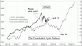
What Happened to the Presidential Cycle? |
Dec 06, 2019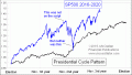
Presidential Cycle Pattern and an Election Year |
Nov 03, 2016
My Final 2016 Poll Analysis |