Shanghai’s Crash

Free Chart In Focus email
Delivered to you every week
The rapid drop in the Chinese stock market earlier this summer has brought out a lot of comparisons to the U.S. stock market crashes of 1929 and 1987. Assuredly there is some pattern similarity, but the difference in both of those cases was that the whole world’s stock markets went down in unison. China’s 2015 crash has thus far not had a large contagion effect; the spot SP500 Index is still just 2.2% away from making a new all-time high.
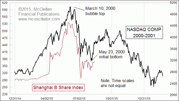
This week’s chart argues that the better comparison is to the 2000 top in the Nasdaq. I say this based on the similarity of the price patterns, and also because the speculative bubble of the 2000 top was more heavily concentrated among the Internet darlings of the Nasdaq. The rest of the market did get a little bit overvalued in 2000, and stocks overall did get pulled down by the swirling vortex of the Internet bubble’s collapse, but not right away. The SP500 waited until Sep. 1, 2000 to make its final high, and then it turned down for the 2-year bear market that was to come.
That is similar to what we are seeing now, with China’s stock market having been bid up by aggressive speculation from Chinese investors. The Shanghai B Share Index has been cut almost in half, and is still down 31% from its all-time closing high.
When I first put these two data plots on a chart together, I moved them fore and aft trying to find the best alignment. It was frustrating because I could see that the dance steps in each pattern seemed to match up, but the Shanghai B Share Index plot seemed to be getting the dance steps done more quickly. Maybe that is a function of our more-automated age; crashes that used to take several weeks can now be accomplished in much less time.
So to display this pattern analog as you see it above, I had to cheat a little bit and show the two plots on different time scales. Stretching out the pattern of the Shanghai B and compressing the pattern of the Nasdaq Comp by a little bit allowed me to get a much more appropriate alignment of all of the dance steps. As an example of what I am talking about, the initial decline by the Nasdaq from its March 12, 2000 top to the May 23, 2000 bottom took 51 trading days. The corresponding drop in the Shanghai B Shares Index’s plot took just 43 trading days.
Stretching time like this may seem like an overly procrustean approach to chart analysis, and to that I plead guilty and say in response that it seems to be working. I’ll take something which does work over something which “should” work any day.
If it keeps on working into the future (and there is no guarantee of that with these pattern analogs), then the implication is for a rise from here to early September, and then some choppy structure before the start of a really long and ugly decline lasting well into 2016. My other predictive tools are saying that we may not actually see higher highs like the Nasdaq’s year 2000 pattern is hinting at for late September and into October. It is possible that the Shanghai pattern could still trace out the same dance steps, but in a slightly different way, sort of like if I tried to dance the Charleston versus how Fred Astaire did it. It would still be the Charleston, but would look a lot different.
Tom McClellan
Editor, The McClellan Market Report
Jun 11, 2015
The Magic of 150 Months |
Jul 30, 2015
Debunking the Fed as the Controller of Inflation |
May 07, 2015
Eurodollar COT’s Leading Indication |