The Unexplainable 4-Year Rerun

Free Chart In Focus email
Delivered to you every week
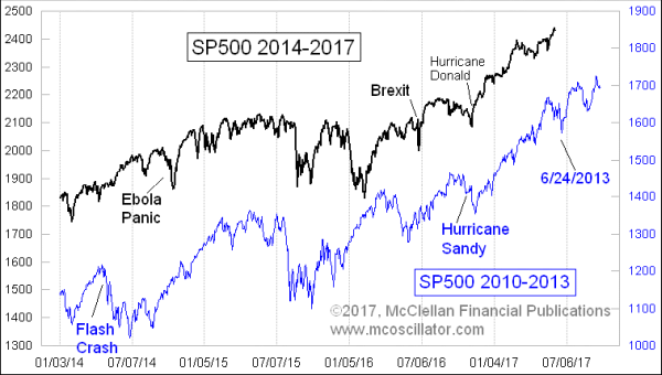
President Obama and President Trump are entirely different types of leaders. No one would contest that. And the second term of a presidential term is a lot different from a first term in the way that a president interacts with the public, with Wall Street, with Congress, and with the economy. So there should not be any stock market similarity between Trump’s first term and Obama’s second term.
And yet the pattern correlation to four years earlier which began during Obama’s second term persists even now, with Trump in office. That is the point of this week’s chart, and it is a relationship I have shown before.
I confess that I had figured that the relationship would break correlation by now, but it seems to want to persist, for reasons of its own. This is where the news followers’ heads explode. Some people think that it is the news that drives the stock market. But if the news is wholly different, and yet the behavior is the same, then perhaps that hypothesis about the news driving the market needs to be revisited.
If this strong correlation continues, then we can look forward to a late-June price bottom, followed by another surge to a higher high in July. Given how strong this correlation has been, would you want to bet against it continuing?
Tom McClellan
Editor, The McClellan Market Report
Jan 12, 2017
Stock Market Still Following Path of 4 Years Ago |
Feb 02, 2017
A-D Line New High |
Oct 13, 2016
DJIA, And the Echo of 2007-08 Oil Blowoff |