Chart Interpretation
Oscillator Breaking Zero
Tom…you being the expert…I was just wondering your thoughts on the McClellan Osc (NYSE) breaking 0 on the first down day off the high if we are in a “bigger or more extended” move?? ...seems in the past, in bigger moves, the first down move in price takes the indicators from strength back to mid points or “0 lines”...and then a second price wave begins.
Thanks!
There are several different issues simultaneously wrapped up in your question, and I will try to address a few of them.
First, taking the Oscillator down to zero is not that hard to do under the current conditions (high Summation Index). For those unfamiliar with this indicator that my parents developed in 1969, the McClellan Oscillator is the numerical difference between two exponential moving averages (EMAs) of Daily Breadth. These are known as the 10% Trend and the 5% Trend, the terminology owing to the original references to EMAs made by P.N. Haurlan. He was a JPL rocket scientist who used EMA math for tracking satellites in orbit, and who was the first to use EMAs to track stock prices.
As of Thursday, Nov. 18, 2004, the 10% Trend was pretty high at +499.55, and the 5% Trend was also high at +428.16. In order to keep a positive McClellan Oscillator value on Friday, we would have needed to have seen strong enough breadth to keep the 10% Trend above the 5% Trend. But instead, Friday saw 1408 net declining issues. That pulled the 10% Trend down to +308.79 and the 5% Trend (which moves more slowly) fell to +336.35. The difference between these two EMAs was -27.55, and that value is the McClellan Oscillator.
When breadth has been persistently strong for a sustained period, the 10% and 5% Trends get pretty high and so it becomes harder to keep them up there. As a result, a negative Oscillator value which appears under such conditions often does not necessarily carry the same bearish implications that it would if the Trends were at a lower value.
There are a few points worth noticing in the first of two attached charts. First, the Oscillator was very recently forming a "congestion zone" where prices chop up and down in a relatively tight range. The drop out of such congestion zones typically leads to a 1-3 day sharp selloff. It looks like this time's sharp selloff got wrapped up in just one day (easy to say that now that the market is up on Monday), and the brevity of this selloff has fairly bullish portents*. Some other congestion zones are labeled in the chart with red lines.
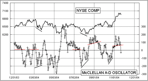
Second, the Oscillator is just coming off of a "complex" structure above the zero line. By that, we mean that the Oscillator has chopped up and down several times without crossing zero. A simple structure, on the other hand, would be described as just an across and back move without building any complexity. Complex structures generally connote strength for the side of zero upon which they form, whereas simple structures imply weakness for the side on which they form. So given the indication of bullish strength from the most recent complex structure, the bears are unlikely to be successful in creating a sustained down move. They may mount a temporary effort to try and win control, but they likely don't have the energy needed to succeed.
If we see more than 832 net advancing issues at the close on Monday [Nov. 22, 2004], then the Oscillator will pop back up into positive territory leaving behind only a one-day dip. That would be pretty bullish behavior. I would not be surprised to see the bears make one more shot at it right here, since I have a pretty big set of bottom signals for Nov. 29. We are still promised some more bullish price action after that bottom in answer to the complex structure above zero we have just seen.
Now, I know what you are saying. You are noticing that there was a complex structure below zero in October which should have meant further strength for the bears. Ordinarily that would be true, and would be the correct interpretation. But October was affected somewhat by the pre-election jitters, so it may not pay for us to make too much of an issue out of October's chart behavior. Also, the choppiness=strength principle is just a tendency, not a guarantee. It appears that any bearish strength which might have been represented by the choppiness below zero in October has been smited by superior bullish strength in November. The Oscillator in October was also making a fairly nice divergence relative to price, which takes some of the oomph out of the complex structure's implications.

This choppiness=strength principle can also be applied to other indicators. If you look at a 14-3 stochastic for December T-Bonds in the second attached chart, you can see this principle at work. In this indicator, the 50 line is the neutral level, equivalent to the zero line on the McClellan Oscillator. Choppy structures (circled) imply strength for their side, and mean that the trend ought to continue in that direction. Simple structures imply weakness. Since early September, both sides are seeing relatively simple structures which means that neither side wants the ball. The result has been a choppy sideways movement for T-Bond prices.
*Portent: What you have to go live in when your indicators fail.