3 Months Into Tax Relief, How It Is Going

Free Chart In Focus email
Delivered to you every week
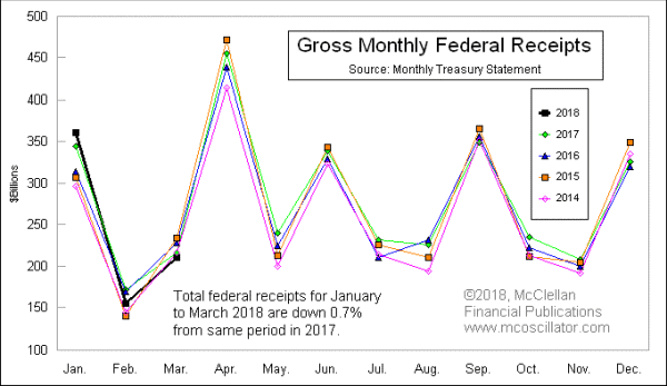
There is a very strong seasonal pattern in the way that tax receipts come into the federal government. The nice thing about that regularity is that it allows us to easily compare how the current year is doing versus past years.
In this week’s chart, the black line represents the calendar year 2018 total federal receipts, as detailed in the Monthly Treasury Statement, or MTS. What we find is that 2018’s receipts are running pretty similar to those of the past 4 years.
This is an important point to note, because the big tax reform which was passed in the 2017 “Tax Cuts and Jobs Act” means lower marginal rates for a lot of taxpayers. So all of that “stimulus” should mean lower revenue for Uncle Sam. And it does, a little bit. As noted in the chart, the total receipts for the first 3 months of 2018 are down 0.7% in dollar terms from the same 3 months in 2017.
That is a pretty tiny decline in nominal terms. And we’ll know even more when the April numbers are tabulated. The drop in February and March revenues stems largely from the changes to the payroll withholding tables, which the IRS did not get rolled out until the middle of January, so they only started having an effect on payroll withholdings beginning in February. April will have the first quarterly estimated tax payments from taxpayers who pay directly, as opposed to via payroll withholding, and that will reflect the reduced tax rates on “pass through” business income (S Corporations and LLCs).
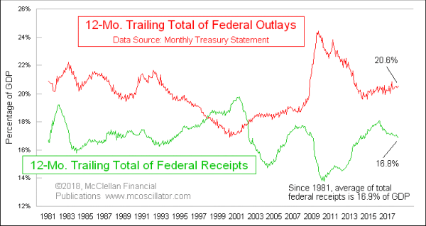
I noted above the very small drop in total federal revenue in Q1. But spending has not declined in the same fashion, and so that widens the deficit. Here is a comparison of total stated receipts versus stated deficits, each expressed as a percentage of GDP:

When the red line (expenditures) is above the green line (receipts), that means the government is running a deficit. Sadly, this is the normal condition of the past few decades, and that is why we have a $21 trillion debt. In the middle of the chart, you may notice that the red line dipped below the green line, which means that (on paper) there was a surplus. But that’s just a case of government accounting covering up reality. Total federal debt has increased in every year since 1960, and so it is not really fair to say that there was an actual surplus in the late 1990s. If you are going more into debt, you are not running a real surplus.
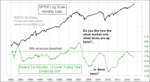
Setting aside that point about accounting rules, our mission here is to figure out what everything means in terms of the stock market. And by that measure, falling tax receipts as a percentage of GDP is undeniably good news for the stock market.

When tax receipts get too high as a percentage of GDP, it can contribute to pushing the U.S. into a recession. Over the past several decades, the recession threshold has been 18% of GDP. There have been recessions which arose when tax receipts did not quite get that high, and 2008 is a great example. But 2008 had help from an incompetent Federal Reserve sucking liquidity out of the banking system at a bad time, so it was not solely a case of the Treasury Department taking too much out in the form of taxes.
If total federal receipts continue to fall as a percentage of GDP, then that will be a bullish factor for the stock market. It may not help solve the problem of the total federal debt, but leaving more money in the hands of investors tends to allow them to do bullish things with that money, like lifting share prices.
Since 1981, the average rate of total federal receipts as a percentage of GDP is 16.9%. The past 12 months is at 16.8%, so pretty much right at the long term average. Trying to tax our way to solvency keeps not working, and keeps pushing us into recessions whenever Congress tries it. But new members of Congress come to D.C. and think “it’s different this time”, retrying the course of action which has failed so many times before.
If the honchos in D.C. want to stop the debt from rising further, then higher taxes are not the way to do it. The clear solution to paying down the debt, according to history, is to get spending down to below the level that the tax receipts can support. That is a terribly unpopular course of action, though, which is why it does not work for very long even when it is tried.
And if Congress can keep from tempting itself to re-try the whole raising taxes plan, then lower rates of taxation as a percentage of GDP should allow for a continued rise in stock prices in the years ahead. How long that bullish factor can continue depends in part upon Congress’ willingness to keep tax rates lower than average. And I don’t have a good way to model that into the years ahead.
Tom McClellan
Editor, The McClellan Market Report
Apr 13, 2018
Fed is Behind, But Still Screwing Up |
Apr 16, 2015
US Taxes Returning to Economy-Killing Level |
Nov 24, 2017
Running Out of Workers |