Running Out of Workers
Free Chart In Focus email
Delivered to you every week
By now you have already heard that the U.S. unemployment rate is down to 4.1%, as of the October 2017 data. But that is only one way to measure what is happening in the labor market. This week, I want to explore some other ways to depict how many people are working, versus some other measures.
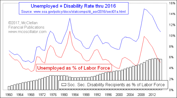
The first chart above compares the headline unemployment rate (year-end values) to another plot which factors in disabled workers. At the end of 2016, the percentage of the labor force who were unemployed was 5.0%. That is slightly different from the “unemployment rate”, because the Labor Department factors out labor force members who have become discouraged and given up looking for a job.
Also shown in that chart is the number of disability payment recipients as a percentage of the labor force. In 2015 and 2016, disabled persons exceeded unemployed ones for the first time ever. It is true that the percentage who are receiving disability payments has been declining slightly for those two years, but this is a pretty high level, historically speaking.
If we add the unemployed and the disability recipients together, then we get the top plot in that chart, showing that together they comprise 10.2% of the labor force. That is a pretty high percentage, meaning that only 89.8% of the working age people who could be working actually are.
It gets worse when we consider that the workers have to support not only themselves and their families, but also those disabled workers who are receiving Social Security Disability payments and those receiving unemployment insurance payments. On top of that, the workers also have to support Social Security Retirement recipients, and the numbers of them are growing:
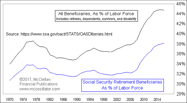
As recently as 2007, Social Security Retirement recipients were just 32% of the labor force. Now that number is up to 38.2%, as Baby Boomers (those born 1946-64) are starting to retire. The tail end of the Baby Boom, those born in 1964, are just 53 years old now, and so there a lot more Boomers coming who have yet to reach retirement age.
In that chart, I also show a plot reflecting the percentage if we include retirement beneficiaries, dependents, survivors, and disability recipients. That number is up to 44.8%!
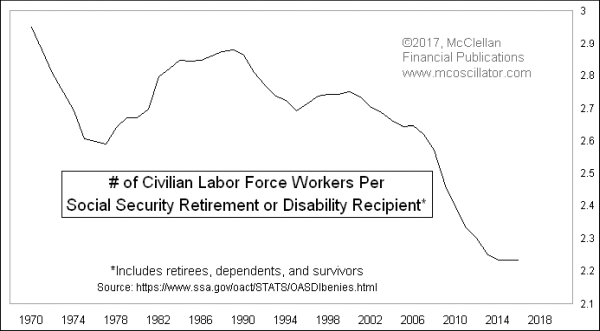
Putting that last statistic in another way, we are getting down close to only 2 workers per recipient of any type of Social Security benefit payment:
Looking ahead, these numbers do not appear likely to get any better. Here is the age demographic profile from the 2010 Census:
.gif)
We are just now hitting the fat part of the Baby Boom in terms of people reaching retirement age. Those people all think that they have “paid in”, and thus should be entitled to collect what is owed to them. But the “Social Security Lockbox” is a myth. There is no pile of money waiting to be paid out. Instead, we have a pay as you go system, with the money going out as payments simply being the money that is coming in from current workers. At some point, if this trend continues, we won’t have enough workers to support all of the beneficiaries, especially if we have another economic slowdown like 2008-09.
For FY2017, according to data from the Treasury Department, the federal government brought in $1.162 trillion for “social insurance and retirement receipts”, including unemployment insurance, and paid out $1.001 trillion. That’s a $161 billion surplus in that area, which is really good, but understand that revenues are up because more people are working and therefore paying into that FICA deduction on your pay stub. If unemployment rises, those revenues will not be as good.
The alarming point, however, is that payouts are growing rapidly. In 2013, the Social Security Administration outlays were $867 billion. To be at $1.001 trillion 4 years later is a 3.6% annualized growth rate in payouts. And those payouts are up 37.6% from FY2009. So unless we can grow the size of GDP and the payments into Social Security taxes faster than the growth rate of the payouts, we are pretty soon going to be digging a hole in the form of payouts faster than it can be filled in by current workers.
So as you enjoy your Thanksgiving feast this week, be sure to thank your children and grandchildren, because they are going to be the ones picking up the tab for the retirement promises made by the Congresses that we have elected.
Tom McClellan
Editor, The McClellan Market Report
Aug 17, 2017
Warm Temperatures Mean Lower Inflation, To a Point |
May 20, 2017
Will Labor Shortage Kill Housing Boom? |
Aug 25, 2016
Echo Boomers Will Fire Up Housing Market |