Warm Temperatures Mean Lower Inflation, To a Point

Free Chart In Focus email
Delivered to you every week
Members of the FOMC have been mystified about why inflation rates have remained low, and that has kept them from “normalizing” interest rates. What they do not seem to understand is that the Fed is not really in control of inflation rates, and thus of interest rates. But when you consider that the Fed has more than 1,000 PhD economists on staff, the likelihood of them looking outside of their lanes for insights is pretty slim, and so they are just not likely to realize that they are not really in control.
In 2015, I offered a reasoned account of how the Fed is not really the main driver of interest rates. Not surprisingly, the Fed officials took little notice of my observations, which I am okay with. The moment when I start affecting governmental policy, or moving the market, is the moment when I have to start reevaluating everything.
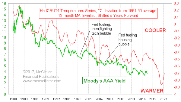
The data show that the real driver of interest rates is actually the global climate. This week’s chart compares long-term global average temperatures to corporate bond yields. The key point to this comparison is that the HadCRUT4 temperature data have been shifted forward by 5 years to reveal how its movements tend to show up again in bond yields after that amount of lag time. And the plot of average temperatures has been inverted in the chart in order to allow us to better see the correlation.
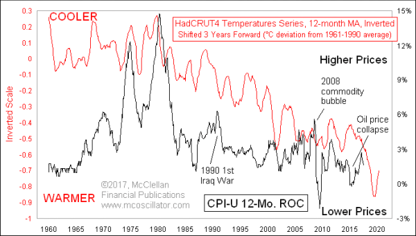
And this correlation also shows up in the inflation rate, which is tied to long term interest rates of course, but with a different lag time. Here is a chart showing a comparison between the same global average temperature data, and U.S. CPI inflation rate data. Once again, the plot of average temperatures has been inverted in this chart, so lower postings mean higher temperatures.

For this chart, it is only a 3-year lag time instead of 5 years, indicating that global average temperatures lead inflation first, and then interest rates. And the big El Niño spike in global average temperatures which saw a peak in 2015 has yet to fully be manifested in inflation rates. It should bring a bottom for the CPI inflation rate ideally in 2019. The implication of the chart is that inflation rates could be negative for the next couple of years, but I am not so sure we will actually see negative inflation rates. This leading indication works better for timing and direction than for the magnitude of movements.
A 2019 bottom for inflation rates should mean a bottom for bonds yields in around 2021, given the differing lag times for those data series. I have no doubt that the Fed economist and officials will continue to be confused about why their actions have not been the decisive factor. They think that the Fed is stronger than Mother Nature.
The message to take from this is that we should all start getting ready for what the recent cooling means. The El Niño temperature peak in 2015-16 means a bottom for inflation in 2019, and a bottom therefore for bond yields in 2021. What follows in the aftermath of global cooling should be a diminishing of prosperity, and a rise in interest rates.
Tom McClellan
Editor, The McClellan Market Report
Jul 30, 2015
Debunking the Fed as the Controller of Inflation |
Jul 07, 2016
NIRP Disrupting 60-Year Cycle |
Sep 22, 2016
Bond Market Knows What Fed Should Do |