Backmasking The DJIA’s Price Pattern

Free Chart In Focus email
Delivered to you every week
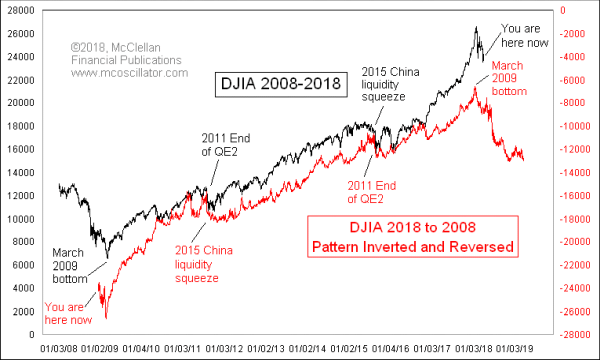
The stock market is continuing to display a weird backwards rerun of its own behavior 9 years ago. I wrote about this here back on Jan. 18, 2018, in a Chart In Focus article titled, “Ending How It Began (Parabolically)?”. That was just a week before the stock market’s blowoff top. So it is time for a review of how things have turned out since then.
Just so you understand what this week’s chart is showing, what I have done is taken the black-line plot of the DJIA, and rotated it around the Z-axis (perpendicular to the page) in order to create the red-line plot. Each one is showing the same thing, it’s just that the red line is upside down and backwards from the black line. And no, I was not smoking mushrooms when I thought up this comparison. I just happened to notice that the parabolic shape of the DJIA’s swoop up in late 2017 looked a lot like the parabolic initiation of the new bull market in 2009, but backwards, and that led me to go hunting to see how the overall pattern fits together.
The steepness of the DJIA’s drop out of the Jan. 26, 2018 top matched the steepness of the drop into the final bottom in March 2009. Now we are into the equivalent of the mushing around phase in late 2008, as the stock market was trying to digest the collapse of Lehman Brothers. If the pattern continues to match up, then we have a lot farther to go down in 2018.
Remember that the red-line plot in this chart is being played backwards. When you do that with a record album, it is known as “backmasking”, and the Beatles were rumored to have embedded backwards messages in some of their songs. Their song Revolution 9 supposedly contains the phrase “Turn me on, dead man” if played backwards. That discovery has led to rumors of other bands also embedding backward messages in their songs, which if nothing else was a good sales gimmick to get music fans to go buy more vinyl.
But hearing words in a song is something that is subject to (mis)interpretation. By backmasking the DJIA in a chart, we can evaluate for ourselves whether this hypothesis of the market reruning itself in reverse has any merit.
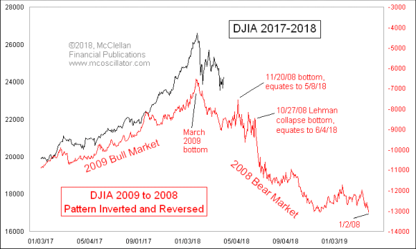
There is a lot of data crammed into that chart above, and so it is hard to see the finer details. So here is another chart which zooms in closer on that comparison:

In this chart, the Jan. 26, 2018 top is aligned with the March 9, 2009 bottom (inverted, and backwards). To validate a pattern analog, I like to see nice alignment leading up to a big top, as well as afterward. This one is not perfect (they never are), but it is pretty good.
Whether this pattern resemblance is going to persist is something we of course cannot know right now. Every pattern analog eventually breaks correlation, and usually at the moment when you are counting on it most to continue working. But if it does continue to work, then you can see what some of the landmarks of the 2008 bear market equate to for 2018.
I would note that my eurodollar COT leading indication calls for a similar decline this year, ending in late August 2018. We show that model frequently in both our Daily Edition and our twice monthly McClellan Market Report, which are available by subscription. The backwards 2008 pattern agrees with that idea of a late August bottom, but then it says prices are going to renew the decline again toward another lower bottom in November 2018. We will have to see how the stock market in 2018 resolves that slight disagreement. For now, however, a downturn beginning around late April to early May is on the script according to both models.
Tom McClellan
Editor, The McClellan Market Report
Jan 18, 2018
Ending How It Began (Parabolically)? |
Apr 07, 2016
Eurodollar COT Throws a Curveball |
Aug 06, 2010
Correlations May Not Be What They Seem |