Consumer Discretionary Sector Shows Enormity of the Beat-Down

Free Chart In Focus email
Delivered to you every week
Investors’ appetites for risk taking can be measured with the comparison of the Consumer Discretionary sector versus Consumer Staples. The big shift in their behavior recently shows the huge abandonment of risk appetite in October to November 2018, but it also creates a huge oversold opportunity.
The staples companies make things which consumers need all the time; our use of tooth paste and toilet paper does not vary much with the state of the economy. But if economic prospects are looking grim, we might exercise “discretion” by holding off buying a new pair of $200 Nike sneakers, or a new car. So if investors perceive a change of attitudes or of spending behavior, they bail out of the stocks of the Consumer Discretionary sector more so than out of the Consumer Staples. That shows up as a movement downward for the relative strength ratio of the two.
My one quibble about how Standard and Poors has configured the rosters of these two sectors is that Starbucks (SBUX) is the 5th highest weighted stock in the Consumer Discretionary sector. A lot of the Starbucks customers who I know do not consider their spending at that chain as optional.
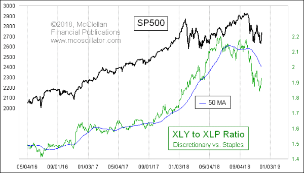
The relative strength ratio in this week’s chart is calculated very simply as the share price of XLY divided by that of XLP. When it is moving higher, that means the Consumer Discretionary sector is outperforming Consumer Staples on a relative basis. And this is a condition which is reliably associated with an uptrend for the overall stock market, as modeled here by the SP500.
This relative strength ratio gave us a warning of trouble when its September and October 2018 tops failed to move higher than its June top, showing a bearish divergence. It confirmed that trouble was here when it plunged aggressively through its 50-day moving average (50MA).
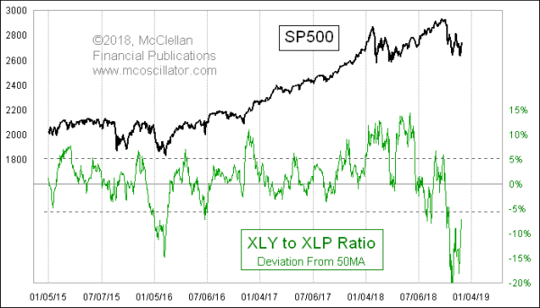
By the time that the SP500 made its twin bottoms on Oct. 29 and Nov. 20, the relative strength ratio had fallen so far below its 50MA that it was actually showing a huge oversold condition. This indication can best be seen in the next chart, which shows an indicator measuring how far the relative strength ratio has moved away from its 50MA:

Under normal market conditions, this indicator shows an extended condition when it goes beyond around +/-5%. But at its extreme low in October 2018, it went all the way to -20%, revealing that in a period of just a few weeks, investors had fled thoroughly out of the Consumer Discretionary sector. That reading exceeds even what occurred in the 2008 bear market (not shown here).
With that extreme low posting now yielding to an upturn for this indicator, the message is that the flight out of Consumer Discretionary was so extreme that it just about cannot get any worse. So that means it should only be able to get better (unless the sky really is falling).
Tom McClellan
Editor, The McClellan Market Report
Aug 30, 2018
Deja Voodoo, 1994 Edition |
Aug 09, 2018
How Seasonality Has Changed |
Jun 08, 2018
Too Much Love for QQQ |