DJI Oscillator Positive Index

Free Chart In Focus email
Delivered to you every week
The DJIA itself might be hanging around all-time highs, but its components are telling a different story. When a higher index high is made on declining participation, that’s a problem.
The indicator in this week’s chart is one I thought up about 20 years ago, one of a set of indicators that look at the 30 Dow stocks to see what they are doing. This is a type of “diffusion index”, which describes an indicator that looks at the behaviors of each member of a group in order to generalize about the group. All market breadth indicators are diffusion indices, for example.
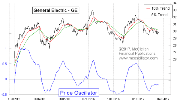
In this case, the indicator is looking at the Price Oscillator for each of the 30 Dow stocks to see if they are above or below zero. When we refer to our Price Oscillators, what we mean is an indicator calculated as the difference between the 10% Trend and 5% Trend (19-day and 39-day exponential moving averages, as some people call them) of closing prices. This is the same math as we use for the McClellan A-D Oscillator, which uses the daily A-D difference as its raw data. The Price Oscillator uses closing prices. This is similar to the math involved in Gerald Appel’s MACD, which typically uses 12-day and 26-day EMAs. Interestingly, Appel came up with that idea in 1969, the same year that my parents developed the math for the McClellan Oscillator (and independently from Appel).
Here is a Price Oscillator for General Electric, for example:

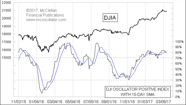
The DJI Oscillator Positive Index seems to follow the underlying trend of the market quite well. That’s a nice property, especially since it is less noisy than the DJIA itself. It is all the more valuable when it shows a change in that trend by crossing its own 15-day moving average.
That is the condition we have right now, with a slight down move for this indicator taking it below the 15MA. It says the presumptive trend for the market right now is downward.
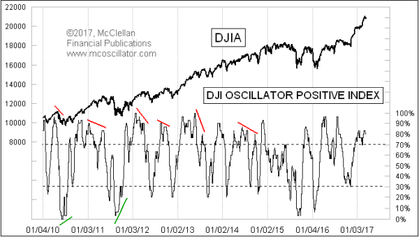
For the bigger picture, this indicator can also give useful messages about high and low extremes. Here is a longer term chart:

When it gets to a true extreme, and especially when it shows a nice divergence relative to the DJIA, that can be a powerful message. We do not have that sort of message now, just a more ordinary type of downturn that begs for a minor pullback, but not a major bear market.
Tom McClellan
Editor, The McClellan Market Report
Feb 02, 2017
A-D Line New High |
Jul 13, 2016
Gobs of Breadth: The Haurlan Index |
Oct 16, 2015
McClellan Oscillator Interpretation |