Gobs of Breadth: The Haurlan Index
Free Chart In Focus email
Delivered to you every week
If you want to have a recipe for a sustainable bull market, the best ingredient to start with is “gobs of breadth”. Strong A-D data is a sign of plentiful liquidity. The stock market can encounter other types of problems, but if liquidity is strong then investors can get past momentary worries about Brexit, earnings, valuations, etc.
I like to say that there are really only 2 fundamentals that matter for the overall stock market:
1) How much money is there? and
2) How badly does that money want to be invested?
For the first one, we look at things like what the Fed is doing with QE, and what the A-D Line says about liquidity actually hitting the stock market. For the second, we use sentiment indicators of various stripes.
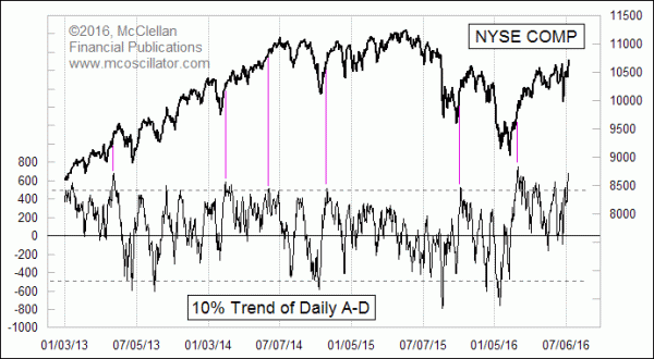
In the wake of the June 23 Brexit vote, there were 2 hard down days, and then a long string of up days for the overall market, and with very strong breadth numbers. That brought us a new all-time high for the NYSE’s A-D Line, and a high reading for the indicator in this week’s chart.
Back in the 1960s, my parents followed the work of P.N. Haurlan, who was a real rocket scientist at the Jet Propulsion Laboratory, and who also published The Trade Levels Report newsletter. Haurlan helped to promote the use of Advance-Decline (A-D) numbers, which had become more famous starting in 1962 when Richard Russell and Joe Granville both wrote about the big divergence that the A-D Line showed ahead of the big bear market that year.
Haurlan was also a fan of exponential moving averages (EMAs), a bit of math that he borrowed from the analog circuitry used back then for rocket guidance, and Haurlan introduced the world to the use of EMAs for tracking stock market data. Haurlan referred to EMAs not by the modern convention of referring to some number of days that supposedly relates to their length, but rather by the “smoothing constant” used to govern how fast the EMA responds to changes in the raw data. We continue Haurlan’s convention of referring to them as 10% Trend, 5% Trend, etc., using the smoothing constants to differentiate between them.
Because most of the EMA calculations in the 1960s were done manually (no calculators then), Haurlan also advocated using roundish number smoothing constants to make the math easier. My parents’ experiments with the data beginning in 1968 involved looking at the 10% Trend and 5% Trend of daily A-D numbers independently. Their key insight was to look at the difference between those two EMAs, which later came to be known as the McClellan Oscillator.
Haurlan also had used the 10% Trend of the daily A-D difference shown above, and he even called it The Haurlan Index without initially revealing what it consisted of. It is a good indicator on its own, and especially this week when we see it up at a really high level.
The 10% Trend of daily A-D can only get up to a really high level like this when there is a big surge of positive breadth like what we have just seen lately. And as the vertical lines in the chart show, a really high peak in this indicator seldom coincides with the final price high for the move.
That’s the key insight. When this indicator zooms up to very high levels, it can serve as a reliable “Not A Price Top” indicator. So there is your headline: Not A Price Top (yet).
Tom McClellan
Editor, The McClellan Market Report
Jul 15, 2011
Long Term Haurlan Index Divergence |
Jul 01, 2011
A Breadth Thrust Signal |
May 13, 2016
Strong Summation Index Promises Higher Highs |