Edson Gould’s Daily Point Index
Free Chart In Focus email
Delivered to you every week
I have spent the past week going through old records, books, and other materials with my father Sherman McClellan, and we came across some promotional materials from the late Edson Gould’s Findings & Forecasts newsletter service. It included descriptions of some of the indicators that Gould used, including ones that he created himself. And that is where this week’s chart comes in.
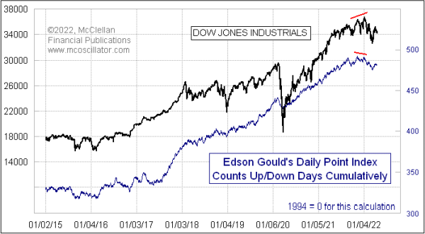
Gould’s Daily Point Index was a rather simple indicator in construction. It looked at whether the DJIA was up or down each day, irrespective of how much it changed, and tallied that on a cumulative basis. In that sense, it is like an A-D Line for all the stocks on the exchange, but only using the end of day index value. I have done similar evaluations of the number of up closes over some lookback period like 20 trading days, but I have never looked at the data before in this particular way.
Gould also separately ran an Hourly Point Index, looking at whether the DJIA moved up or down in each hour of the trading day. I have not yet done the work to code that for study.
What I see in the chart above is that this Daily Point Index has pretty much done what prices have done, which is not what you want an indicator like this for. You want an indicator that is going to give you a different answer from what prices are saying, and to do so only at the times when such an answer will matter. It did show a nice bearish divergence in December 2021, foretelling the troubles that the stock market has gone through during early 2022.
But I have to concede that after going through several years of seeing an indicator not give us any signals (during what was admittedly a Fed-stimulated market period), I might have given up looking at this indicator had I been following it, and thus I probably would have missed knowing about that December 2021 signal.
Gould is perhaps best known these days for coming  up with his “Three-Step-And-Stumble Rule”. It came from another era, when the Federal Reserve effected monetary policy using somewhat different tools than the current Fed uses these days. That rule states:
“Whenever any one of the three rates set by the monetary authorities - - the rediscount rate, the rate for bank reserve requirements, and the margin requirements on stocks - - increases three times in succession, the investor should beware, because invariably, when this has occurred, the stock market has subsequently, usually with some delay, suffered a sizable and sometimes severe setback.”
Yes, kids, the Fed really did used to tighten or loosen conditions by changing how much you could leverage your money and invest on margin with your broker. They have not changed that initial margin rate from 50% since 1973, although some brokerage firms do set more stringent requirements for their customers. It has gotten up as high as 90% back in the late 1950s, meaning you could only borrow 10%. And they set it at 100% in 1946, meaning no borrowing to trade on margin at all.
Turning back to the Daily Point Index, it has shown some interesting indications in earlier years. Here is a look at 1997-2006, just for example.
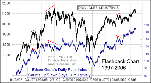
During this period, we did see a few more interesting divergences. It did not show us a divergence at every point when we might have wanted to see one, but these ones it did show were indeed good looking ones. If you looked closely at its movements versus those of the DJIA, you might be able to find a few more such divergences. This indicator does not seem to be much good at showing us bottoming conditions for prices.
Our predecessors decades ago had to do their analysis without the ease of computing power that we now enjoy, and that perhaps explains their preference for indicators that were easy to compute. The Daily Point Index is indeed very easy to compute, but would still need to have been kept by hand on a ledger, and plotted by hand to chart it back in Gould’s days. I would not want to go back to those days, except for a nostalgic look like this one.
Tom McClellan
Editor, The McClellan Market Report
Jan 31, 2020
How are Stocks Going Up While Earnings Go Down? |
Dec 27, 2018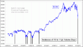
Finally a 10-1 Up-Volume Day |
Aug 19, 2011
Death Cross Does Not Live Up To Its Hype |