Global Temps Call for 2015 Yield Bottom

Free Chart In Focus email
Delivered to you every week
While the debate rages over global warming, I find that the data on global average temperatures can be put to another use: forecasting interest rates. And the big message for us right now is that yields are due to hit a bottom this year, and head upward into 2017.
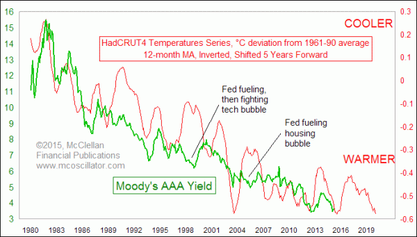
In the chart above, I am showing the average yield on Moody’s AAA rated corporate bonds. That’s the green line. The red line is an inverted plot of the HadCRUT4 global temperature series, developed and maintained by the Hadley Centre’s Climate Research Unit at the University of East Anglia in England. It is derived from measured temperatures over both land and sea.
In addition to inverting the plot of temperature data, I have shifted it forward in the chart by 5 years to reveal how the AAA yield tends to follow in the same footsteps with that 5-year lag. It does not work perfectly, just really well. Occasionally the Fed can put its thumb on the scale and mess up the nice correlation, but that’s not a surprise.
This is one of a variety of relationships I have uncovered when examining various climate datasets. You can read more in a paper I wrote for the MTA Journal titled, “Looking To Our Own Planet For Market Insights”.
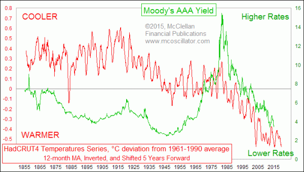
The chart above shows a very good correlation between the two sets of data over the past 35 years. The correlation also works further back in time, although perhaps not quite as well as it has lately. Our modern financial markets have freer movements of capital than at other times in history, and also a better quantification of prices, yields, and other data. We also have better and more complete temperature measurements now than in the 1800s. So while the correlation 100 years ago might not be as precise as today, the 60-year cycle that shows up in both global temperatures and interest rates is still apparent.

The reason why temperatures and interest rates are related likely stems from agriculture. Warmer temperatures generally mean greater crop yields, which means lower food prices, and eventually lower inflation, so interest rates can come down. Similarly, crop failures and famines tend to arise more from cooling periods for global average temperatures. Whether or not that explanation satisfies everyone, the correlation between interest rates and the offset temperature data is hard to ignore.
While I am pretty confident about the prospects for a yield bottom in 2015, I am less confident about the implications 5 years from now from the most recent warming phase. You probably saw the headlines about 2014 being declared “the warmest year in modern record”. That assertion comes from examination of a different dataset on global average temperatures maintained by NOAA. The HadCRUT4 series came close in 2014, but not a record.
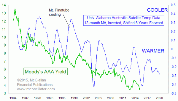
But other measurement techniques such as satellite data do not concur. Here is the same comparison between the Moody’s AAA yield and a temperature series from the University of Alabama at Huntsville. They take data from satellite measurements going back to 1979.

In the satellite data, the most recent warming period in 2013-14 shows up as much more muted, implying less of a downward move for interest rates in 2018-19. The direction is the same as in the other data, but the message for how low yields might dip again into 2020 is much more muted.
As for me, I come down on the side of more muted recent global warming than what the direct measurement temperature series indicate. Several studies have pointed to anomalies in the way that temperature data in these datasets have been “adjusted”. See this and this.
In addition to the different findings of the satellite data, we also have record ice area in the Antarctic, and growing ice area in the Arctic, taking the current Arctic ice covered area back up to 1980s levels. Boston has had record snow this year, which was not supposed to happen under “global warming”. It is a controversial topic, but there is room to conclude that we don’t have all of the answers on climate change that some people think we have.
The point for investors to take away from this is that if corporate (and other) bond yields continue to exhibit the correlation we have seen to global temperatures data, then we can expect to see rising rates starting in late 2015 and continuing through 2016.
Tom McClellan
Editor, The McClellan Market Report
Aug 27, 2010
60-year Cycle In Interest Rates |
Jan 29, 2015
Dollar Is Wandering Off Track |
Nov 14, 2014
More Good News for Employment |