The Real Relationship Between Dollar and Stock Market

Free Chart In Focus email
Delivered to you every week
If you think that you know the one true relationship between the stock market and the value of the dollar, you are wrong. Or perhaps I should say more charitably that you are going to find yourself wrong about half of the time.
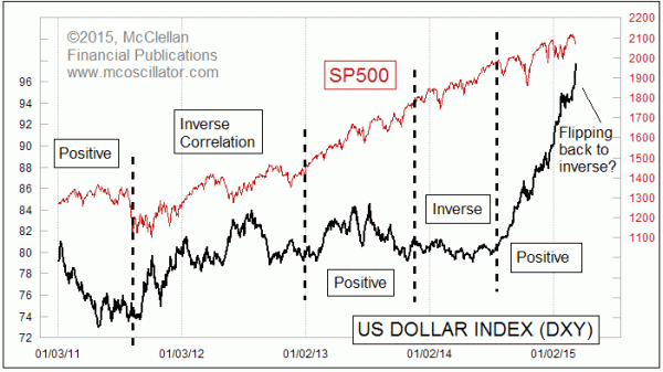
The truth is that the US Dollar Index (DXY) and the SP500 show a positive correlation sometimes, and then at other times it flips to an inverse correlation. And this has been going on for years. I have tried mightily to find the causative agent which makes the relationship flip back and forth, but it is elusive.
Since around September 2014, the relationship has been a generally positive correlation. As the dollar has appreciated, it has attracted money into U.S. based assets, including our stock market.
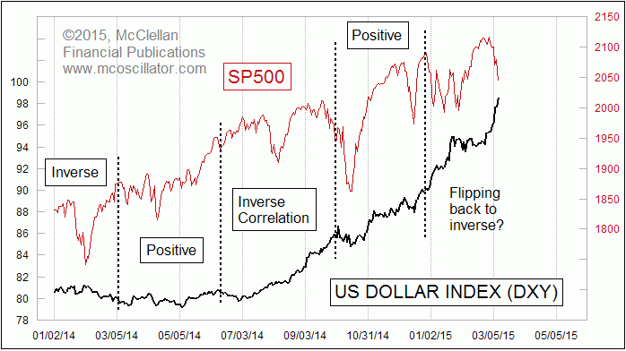
But on Tuesday, March 10, 2015, we saw the DXY move higher by more than 1%, and the SP500 moved downward by 1.7%. On the basis of that one day alone, we seem to be seeing the relationship flipping back to inverse again. So to take a closer look, this next chart zooms in on a shorter time period:

When we look closer, we can see even more periods when the correlation has flipped from positive to negative and back. And it becomes clearer that the Dollar Index and the SP500 have been in an inverse correlation since late December 2014.
When I have shown this relationship to other analysts in the past, they have asked me why I don’t use a Pearson’s Correlation Coefficient to delineate the periods of positive versus inverse correlation? My answer is that Pearson’s has problems that make it almost unusable for this purpose. If you have two sets of data which trend in the same direction even though they move inversely in their shorter term movements, then Pearsons will tell you that there is a strong positive correlation. For more on that topic see this article.
There are other statistical tools which one could use to better tease out the specific degree of instantaneous correlation between the DXY and the SP500. All of them involve additional work massaging the data, and all introduce their own statistical side effects.
My response is to set aside the issue of trying to quantify the degree to which these two are positively or negatively correlated at any given time. Instead, one can get the more important insight from just looking at the chart, and that insight is that the relationship changes periodically. It is not a reliable or trustworthy relationship. So if you think you can construct an “if-then” statement about what the stock market should do given a certain behavior in the dollar, then you are likely to end up disappointed as the correlation flips on you.
Tom McClellan
Editor, The McClellan Market Report
Aug 06, 2010
Correlations May Not Be What They Seem |
Jan 29, 2015
Dollar Is Wandering Off Track |
Oct 03, 2014
Commercials Betting On Big Dollar Downturn |