2-Year T-Note Shows Path For FOMC

Free Chart In Focus email
Delivered to you every week
I wrote back in 2011 that the Fed could do a lot better with interest rate policy if the FOMC would just outsource the decision making task to the bond market, specifically the 2-year T-Note yield. The point is still the same, and the FOMC is still seemingly unaware.
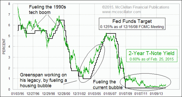
To review briefly, this week’s chart shows a comparison between the 2-year Treasury Note yield and the target rate for Fed Funds, which is set by the FOMC. The NY Fed is then tasked with adding or withdrawing money available to loan to eligible depository institutions so that the “effective” rate of such loans is close to the target set by the FOMC. Read more about that process here.
If the NY Fed overdoes it, that can result in more money than the depository institutions are seeking to borrow at the target rate, and that itself can be stimulative. But so can having a target rate that is lower than it ought to be for the market conditions, which is the subject of this week’s article.
What we have learned from years of looking at this is that if the Fed would just set the target rate at the level of the 2-year T-Note yield, things would go a lot better. We would have a lot fewer bubbles and crashes, and the ones we do see would be a lot less severe. It is when we see the target rate set way above the 2-year T-Note yield that we get bear markets and recessions.
And it is conditions like we see now, with the Fed Funds target rate below the 2-year T-Note yield, that are tremendously stimulative to the stock market. Some would say it is over-stimulative.
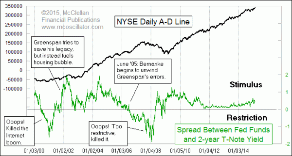
To help see this better, this next chart looks at the spread between the two rates. And for comparison, I include the NYSE’s Cumulative Daily A-D Line, which is perhaps the best indicator there is of stock market liquidity. When the Fed is being stimulative by keeping the target rate too low, that’s generally a good thing for the stock market, or for fueling a housing bubble. And when the Fed thinks it knows better than the bond market what medicine is needed, we get events like the Internet bubble collapse, and the 2008 financial crisis.

Since early 2009, the Fed has succeeded in keeping the target Fed Funds rate basically at zero, and thus below the 2-year T-Note yield. The result has been a strong uptrend for the NYSE A-D Line. They have also succeeded in creating a scary valuation level on several indicators.
The financial markets are still overly focused on the adjectives chosen by the FOMC for its post-meeting statements, and whether or not Janet Yellen uses the word “patience” when she appears before Congress. What investors should be focused on instead is the growing spread between the 2-year yield and the FOMC’s target rate. The bigger that this spread gets, the greater the stimulation of the next (current) bubble.
So if anyone from the Federal Reserve calls you and asks what they should do with interest rates, just tell them to set the Fed Funds rate to track the 2-year T-Note yield, and then take the rest of the decade off. The message of the bond market is an important one. When the Fed engages in price-fixing in the interest rate markets, that’s like shooting the messenger.
And at the moment when you see the Fed decide that it knows better than the 2-year yield, pushing the Fed Funds rate above that mark, you should start to worry, a lot. That does not seem to be in the cards now, and by the time that event does come around, we will have a whole new generation of investors (and money managers) who have no experience with what it is like to have a restrictive Fed. So they can be counted on not to understand it well, and to assert that “it’s different this time”.
Tom McClellan
Editor, The McClellan Market Report
Mar 04, 2011
2-Year T-Note Should Guide The Fed |
Jul 31, 2009
Spread between 2-year yield and FF rate |
Jul 31, 2014
A Scary Valuation Indicator |