Oil/Gold Ratio
Free Chart In Focus email
Delivered to you every week
All prices are really exchange rates. Sometimes we exchange dollars for bananas, or shares of XYZ Corp. for dollars. But one could come up with a theoretical price series of bananas per share of XYZ Corp., and it would be just as valid for analysis as any other comparison.
The price of gold has an interesting ability to give us a leading indication for what the movements of oil prices are going to look like, as discussed here. But in the long run, gold and oil can also get to be expensive or cheap relative to the other, and there are insights to be gained about both of them from looking at this relationship.
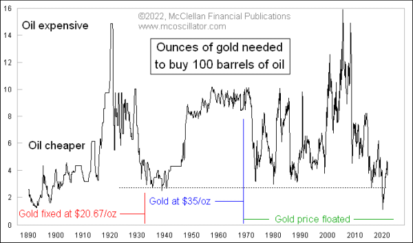
This week’s chart looks at the oil/gold ratio, expressed in a slightly different way just to make the numbers make sense. Right now, it would take right at 5.0 ounces of gold to buy 100 barrels of oil. But that is actually a pretty low number compared to the long term average of 6.2 for all of the time since the 1890s, when oil price data first started being tabulated in a meaningful way. For more than half of that period, the dollar price of gold was fixed by the U.S. government, so perhaps we should focus more on the period since 1969 when the price of gold has been floated. Over that period, the average has been 6.6. So the current reading of 5.0 is a little bit below average, meaning that oil is cheap compared to gold.
It is not as cheap as it was at the depths of the Covid Crash low, when near month oil futures got down as low as $13 a barrel (it was only a single contract that was about to expire that went negative then). That moment saw this ratio get down as low as 0.78 oz per 100 barrels, which was an all-time record low. So the rebound in this ratio has just been a partial return to “normal”.
Zooming in closer on this ratio, we can see a bit of order in what looks just like chaos on the longer term chart. Here is that ratio since 1993:
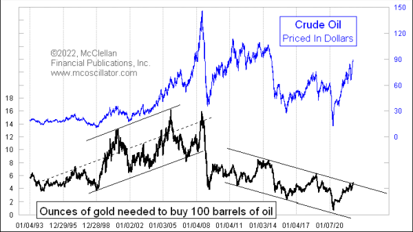
During the 1990s and 2000s, this ratio was in a rising trend channel as oil prices were trending higher. The 2008 commodities bubble seems to have broken that trend, and shifted to a declining trend channel for the past 12 years or so. The latest up move in oil prices to above $90/barrel has this ratio appearing to break out above the upper boundary of that downtrend channel, perhaps marking a new trend getting itself going. Or perhaps it is a false breakout that will fail and push this ratio back down into the downtrend channel for a while longer.
One point about downtrend channels is that eventually they run into the bottom of the chart, and that makes an eventual upside breakout a certainty. Eventually.
The run higher in oil prices may only have a little bit longer to run, though. Gold prices lead oil prices by just about 20 months, and so the August 6, 2020 gold prices top is foretelling an oil price top in late March 2022, something we have been discussing a lot in our twice monthly McClellan Market Report newsletter. Find out how to subscribe at https://www.mcoscillator.com/market_reports/.
Tom McClellan
Editor, The McClellan Market Report
Sep 30, 2021
Gold Says Oil Prices Heading Higher into 2022 |
Oct 13, 2021
Why Presidents Should Care About Oil Prices |
Feb 13, 2020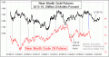
Crude Oil’s Drop Was Foretold by Gold |