Silver Blowoff
Free Chart In Focus email
Delivered to you every week
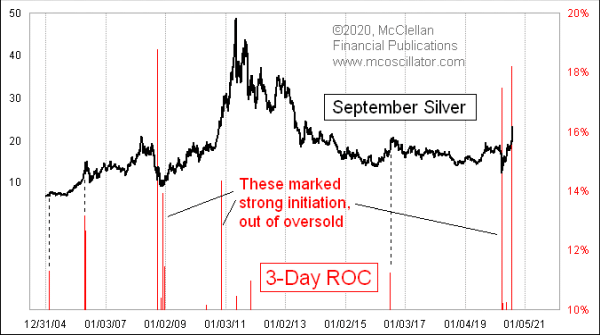
Silver prices have had quite a run since making a Covid Crash bottom on March 18, 2020, and especially so in the past few days. Silver futures bottomed in March at the $12 level, and just cleared the $20 mark on July 20 for the first time since September 2016. And prices accompished that surge in a big rush. That is what this week’s chart is all about.
It shows a 3-day percentage rate-of-change (ROC). It is simple math, evaluating the percentage change in prices from 3 days before. One trick for this chart is that I purposely set the lower limit of the Y-axis scaling to +10%. This hides the lesser readings from our view, making it easier to focus on just those instances when there is a really high reading like this. If I had not done this scaling trick, the chart would have looked like this:
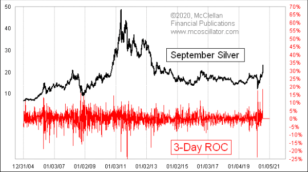
This scaling makes for too much noise, so we cannot see the readings which matter.
If we turn our attention back to the first chart, we can see that these readings above +10% are pretty rare. And the meaning of such a reading depends on the context in which it arises. When a high 3ROC reading appears just after an oversold bottom, it can signal the start of a strong new rebound. But when it appears in an uptrend that is already underway, as in the current instance, the meaning is different. It signals a blowoff top for silver prices.
Silver traders are not like other traders. They are the hot money, and they can get excited at the wrong times. When they do, it shows up as a blowoff top, like what we are seeing now.
This behavior also shows up when we look at a comparison of silver to gold prices. This next chart shows the gold/silver ratio:
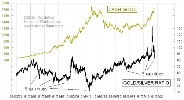
Big upward spikes in this ratio tend to mark important bottoms for gold (and silver) prices. And big drops in a short period of time usually come about because of silver prices racing up faster than gold prices. Such sharp drops tend to mark important tops for both gold and silver prices.
I have seen some analysts who look at the recent drop in this ratio, and conclude that it still has a lot further to go before it gets back down to some sort of median level. Thus, they believe, silver can still keep rising a lot further from here.
I do not read it that way. When I see such a large drop in this ratio, that means there has been a huge disparity in the performance of silver versus gold. And those events are associated with traders exhibiting an excessively speculative mood, meaning blowoffs for prices, regardless of the ratio’s level.
Tom McClellan
Editor, The McClellan Market Report
May 03, 2018
Gold/Silver Ratio |
Jun 17, 2020
Copper/Gold Ratio |
May 14, 2020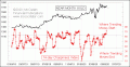
Gold’s Choppiness Index |