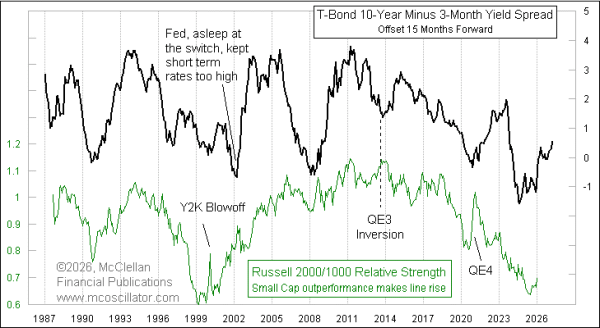
Steepening Yield Curve Good For Small Caps
Free Chart In Focus email
Delivered to you every week
Now that the Fed has cut short term rates several times, we are seeing a further steepening of the yield curve. It is tough to portray the entirety of changes in the whole yield curve over time, and so I am summarizing it in this week's chart by showing just the spread between 10-year and 3-month Treasury yields.
The 10y-3m spread does a really cool trick, which this week's chart illustrates. Changes in that 10y-3m spread draw us a roadmap for what small cap outperformance or underperformance is going to look like.
The green plot in this chart is the relative strength ratio of the Russell 2000 vs. the Russell 1000. It is calculated by simply taking the numerical value of the Russell 2000 Index, and dividing it by the Russell 1000. The line goes up when small caps are outperforming on a relative basis, and it goes downward when large caps are doing better. And the cool part of this trick is that the green plot makes those movements corresponding to what the 10y-3m spread was doing 15 months prior. We are getting the answers ahead of time.
They are not perfect answers, though. The nice predictive relationship can break down when the Fed is putting a thumb too heavily on the scale with actions other than interest rate policy. QE3 in 2013 caused a temporary inversion of the relationship. And in 2020 the Fed started QE4 in response to the Covid shutdowns, which also disrupted the nice correlation for a while.
The Fed is doing QE5 now, although (shhhh!) we are not supposed to call it that yet. But the magnitude of the Fed's recent purchases is a lot smaller than what we saw in prior rounds of QE, so the potential for skewing the leading indication is likely much less now.
The Russell 2000/1000 relative strength line bottomed in July 2025, and has been rising since then as small caps have started outpeforming again after a really long period of underperformance. Seeing what the 10y-3m spread has been doing, its message is that we should expect small caps to continue outperforming for at least the next 15 months. We do not yet know the end point of that projected small cap outperformance, because we have not seen a topping out of the 10y-3m spread.
Tom McClellan
Editor, The McClellan Market Report
Jan 23, 2020
Small Cap Underperformance Is Not Over |
Feb 26, 2021
Yield Curve Steepening, and Small Caps |
Jun 20, 2024
Yield Curve’s 15-Month Lag |