Still The Only Chart That Matters
Free Chart In Focus email
Delivered to you every week
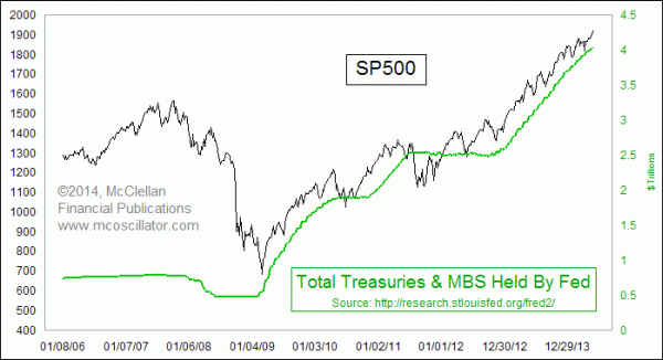
The FOMC has continued to "taper" the monthly amounts of its purchases of Treasury bonds and Mortgage Backed Securities (MBS), but the Federal Reserve is still pumping money into the banking system at a high rate. Purchases in June are to total $45 billion, and it goes down to $35 billion in July 2014.
But $35 billion a month is still a large number. And the injection of this money is still pushing up the stock market. This week's chart is one that I showed back in November 2013, calling it "perhaps the only chart that matters for now". The slope of the Fed's balance sheet continues upward, and so does that of the stock market.
The FOMC under Dr. Yellen is betting that it can slow the pace of these purchases in just the right way so as to avoid the problems that the Fed created when ending previous programs of "quantitative easing" (QE). When QE1 ended in April 2010, we saw the "Flash Crash" in the very next month. The Fed realized it stopped too soon, and so we got QE2, which was great until it ended on June 30, 2011. The very next month, July 2011, saw another sharp decline, and so the Fed had to restart more QE which is what we are still left with today.
The Fed actually tried to shrink its holdings of Treasury bonds back in 2007 and 2008, a move which contributed to the severity of the financial crisis 2008. So the members of the FOMC understandably don't want to risk doing THAT again. But even when they just bring the QE purchases to a halt, the stock market crashes and banks are in danger. How they are ever going to unwind their $4 trillion (and climbing) balance sheet is a question I just cannot answer, and I do not think that many in the FOMC have a good answer either.
But for our purposes now as stock market investors, it is sufficient to note that the Fed's balance sheet is still getting larger, and that is still bullish for the stock market. It may not be as bullish as when it was $85 billion a month, but it is still an upward slope. When the Fed gets down to zero again later this year, we can start to worry.
Tom McClellan
Editor, The McClellan Market Report
Nov 21, 2013
Perhaps The Only Chart That Matters (For Now) |
Feb 13, 2014
Can Earnings Get Better Than This? |
Sep 19, 2013
A Cooling Planet Means Price Inflation |