The +500 RASI Might Actually Be Different This Time
Free Chart In Focus email
Delivered to you every week
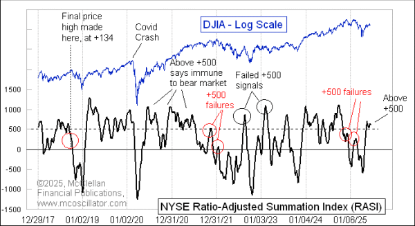
The strong breadth since the April 8, 2025 tariff crash low has produced a new all-time high for the NYSE's daily A-D Line. It has also taken the the Ratio-Adjusted Summation Index (RASI) up above the important +500 threshold. These two conditions are almost always a recipe for uptrend continuation. This time might be different.
Normally gobs of breadth is a really great thing for the stock market. It is a sign that liquidity is plentiful, because if even the least deserving stocks can get some money to lift them day after day, then liquidity must be strong. Seeing the RASI climb back up above +500 after a dip is normally a sign that breadth is strong enough for the market to achieve "escape velocity", so that it won't have to go back down to a prior price low. While this is usually a good rule, there can be exceptions. A better rule is that if the RASI fails to get back up above +500, then the market has big problems.
We saw exceptions to this RASI +500 rule in August 2022 and again in February 2023, when the RASI got well up above +500, and those rallies still fizzled. Both of those examples are highlighted in the chart above as "Failed +500 signals".
I want to focus especially on the August 2022 instance, which looked like a great strong rally as it was happening, complete with strong breadth data. Several "breadth thrust" type signals were generated then. But it still turned out to be a failing countertrend rally, and the bear market of 2022 resumed itself, going lower to a final bottom in October 2022.
Here is a chart comparing the price structure today to that 2022 failed rally:
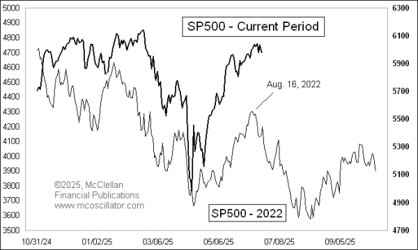
When I examine a chart pattern analog like this, I want to see a lot of alignment of the lesser price wiggles to validate that it is a meaningful comparison. The magnitudes of the price moves are far less important than the alignment of the dance steps. This point confuses a lot of people, who think that the size of the price movements is what matter. That is the same crowd who proclaim that "10% is a correction and 20% is a bear market". They just don't understand stock market physics.
Seeing similarity of price patterns tells us that there is a similar underlying dynamic between the current market action and the prior period. The basis for this is that similar conditions produce similar patterns. People get hung up on this point, and point out that valuations are different, or the Fed, or the White House, or earnings, or some other factor. My response is that if those types of conditions are different but the pattern comes out the same, then those must not be the conditions which matter for driving price behavior.
This one is not a perfect pattern analog, but then I have never seen a perfect one. There are just varying degrees of how good a comparison is, and this one is quite good. If the similarity persists, then we should see a drop to a low at the end of June, followed by a brief spike rally and then more selling into late July to early August.
2022 serves as an example of the principle that even a strong breadth signal can fail. It is possible. And for the moment we are seeing the market trace out similar dance steps to what we saw in 2022, so it is time to be watchful for falling prices.
Tom McClellan
Editor, The McClellan Market Report
Jun 06, 2025
Yield Curve’s Predicted Recession Is Arriving |
Feb 14, 2025
Closing the Book on 1981 Analog |
Nov 26, 2021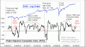
RASI Failed At +500, Bad News For Bulls |