The Myth of Earnings’ Importance
Free Chart In Focus email
Delivered to you every week
Under the standard valuation model for the stock market, earnings are all-important. They drive valuation measures like the Price/Earnings (P/E) Ratio, and help fundamental analysts figure out how much a stock is worth. Many analysts extrapolate that forward to the whole stock market, which can be a problematic exercise.
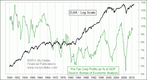
As we near the end of March, and thus of the first quarter of 2013, the earnings reports are still trickling in for the 4th quarter of 2012. The Commerce Department's Bureau of Economic Analysis (BEA) still has not even published Q4 figures for corporate profits. That is an important point to note in light of this week's chart, which compares the movements of the DJIA to the BEA's measure of corporate profits as a percentage of GDP. To access the data in this chart, see http://www.bea.gov/iTable/iTable.cfm?ReqID=9&step=1, and then proceed to Table 1.10, Gross Domestic Income by Type of Income. Line 17 has corporate profits, and then you just need to divide that by quarterly GDP data which can be found at http://www.bea.gov/national/xls/gdplev.xls.
The typical argument of a fundamental market analyst is that profits drive everything, and so waiting for word of what profits have done is an appropriate action before making decisions about how, when, and if to invest in the stock market. But there are multiple problems with this premise. The first is the presumption that earnings are predictive of future stock market action. It is perhaps easier to provide justification for the opposite argument, i.e. that stock market movements are predictive of earnings data.
This measure of profits as a % of GDP peaked in the 2nd quarter of 2007, which was ahead of the final stock market top in October 2007. But we did not know that corporate profits had peaked in the 2nd quarter until late in the 4th quarter, when the BEA's data finally showed that corporate profits had turned down. And given the see-saw nature of that quarterly data, it would have been easy to dismiss one quarter's downturn, and not believe that a real problem existed for earnings until well into 2008. By then, the DJIA was already in free-fall.
You see, the 2007 example illustrates how the lag in earnings reporting creates a big problem. The fundamental analysts can be right about earnings being important for the future of stock prices if we examine them only in retrospect, where they can be compared side-by-side with the market action of the day. But when we factor in the reporting lag for such data, we find that waiting for the earnings message can mean getting data which is already almost 6 months in arrears by the time that it arrives for us to consider.
One other myth that we hear frequently is that corporate profits now are higher than at any time in history. But this week's chart reveals that this myth is just not true. They are admittedly high, especially in comparison to the readings for the past 40 years. But from the beginning of the BEA's data in 1947 up through 1966, corporate profits averaged 10.3% of GDP, which is actually higher than the most recent reading of 9.8% for Q3 of 2012. So one could simultaneously argue that the most recent level is "high" compare to recent years, and also argue that it is still low compared to historic levels. Which argument you hear from someone will tell you what that speaker's bias is.
One point that we can say history does support is that when corporate profits as a percentage of GDP get up this high, the Federal Reserve usually steps in with tightening monetary policy, acting like the overspeed governor on an engine by retarding the throttle to keep the RPMs from getting too high. Thus far, the current group of Fed officials have not indicated in their recent comments that they see this current situation as being similar to past instances when tighter policy came about. But if corporate profits remain at a high percentage of GDP, then the Fed's decision makers are going to have a harder time continuing to justify the free-money policy.
Tom McClellan
Editor, The McClellan Market Report
Feb 14, 2013
Fed’s POMOs Keep Market Aloft |
Jan 04, 2013
Employment Levels Stubbornly Unresponsive |
Feb 17, 2012
Fed Sloshing The Liquidity Pool |