Treasury-Bund Spread Just Gave Stocks New Life

Free Chart In Focus email
Delivered to you every week
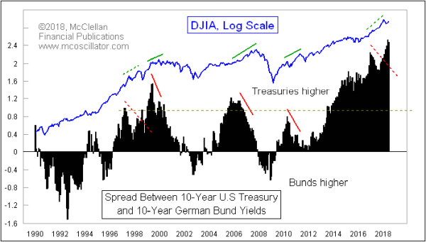
Since the early 1990s, there has been a pretty good correlation between the movements of the DJIA and the spread between the 10-year U.S. Treasury yield and the equivalent yield for German sovereign debt. The German bonds are commonly referred to as “bunds”, shorthand for the German word “bundes”, meaning federal.
This Treasury-Bund spread also has the interesting property of giving us an early warning of major secular tops in the U.S. stock market. When it rises up to a very high level, and then makes a divergent top relative to the DJIA, that is a warning sign that trouble is coming a few months later. I wrote about this here in June 2017, when such a divergence was evident, and I concluded that it was telling us that big trouble was coming at some point in the future.
But now that message has been superseded by new information. The supposed divergence that was evident in 2017 has now been undone, as the Treasury-Bund spread has risen even higher. That says the major top of the secular bull market which began at the 2009 low is still ahead of us, even though a scary correction can still come along at any time.
So the divergence indication has now been reset, and we can start looking for another one months from now, if that spread starts to contract while stock prices continue higher. This cancelation of a signal is something that has happened before. Back in 1998, there was an apparent divergence, but then after a quick 20% decline in the stock market, both the Treasury-Bund spread and the DJIA were able to power up higher. Later, at the 2000 market top, another divergence had developed, and it indeed foretold of the stock price decline that was to come as the Internet Bubble was unwound.
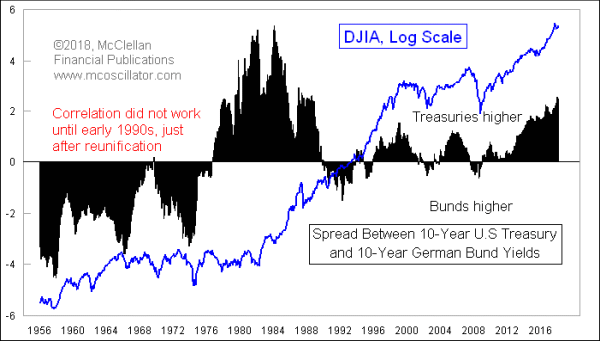
It is also important to understand that this relationship has not always worked. Here is a longer term chart:

The correlation between the Treasury-Bund spread and the DJIA really does not seem to have started working well until around the early to mid-1990s, which was just after the Berlin Wall fell and the two Germanys were reunified. Why that mattered for this correlation is something I cannot answer. But we now have 20+ years of it working, and so that should satisfy observers that it really is an actual phenomenon now.
The Treasury-Bund spread’s May 1999 peak preceded the DJIA’s monthly closing high by 7 months. Its Oct. 2005 peak was a full 2 years ahead of the stock market’s Oct. 2007 peak. And the Treasury-Bund spread’s April 2010 peak was 12 months ahead of the April 2011 price top.
That is a small sample size of major events, but major bull markets do not end all that often. The message now from seeing a continuing rise in the Treasury-Bund spread is that we are at least several months away from the big final end to this decade’s long bull market. But again, that does not mean we cannot have a scary correction, as is typical during the second year of a presidential term.
Tom McClellan
Editor, The McClellan Market Report
Jun 30, 2017
Treasury-Bund Spread Gives Early Warning of the End |
May 18, 2018
What Happened to the Presidential Cycle? |
Feb 23, 2017
Crude Oil Foretold the Trump Rally 10 Years Ago |