Treasury-Bund Spread Gives Early Warning of the End

Free Chart In Focus email
Delivered to you every week
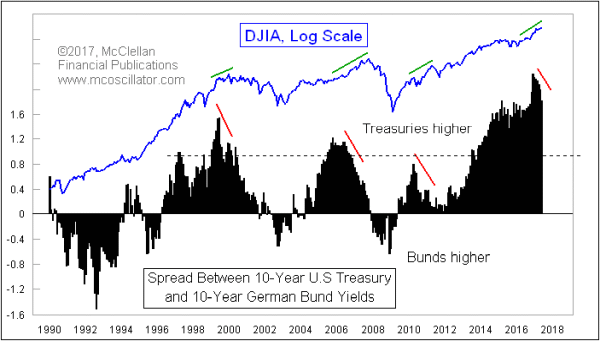
The 28-year record high spread between 10-year T-Notes and German 10-year “bunds” is finally starting to narrow just a bit. This is a warning that the great bull market in stock prices from the 2009 low is in its last stages. But it is not done yet.
Ever since June 2009, the yield on the US 10-year T-Note has been higher than its German counterpart. It turns out that this is a pretty bullish condition, at least for as long as the spread between the two is rising. As a bull market ages, though, this spread shows the wearing out by displaying a divergence relative to prices. It can take many months for the divergence to finally matter, and bring a meaningful price decline. We are just now starting to see those first signs of such a divergence.
This spread peaked in May 1999, 7 months ahead of the DJIA’s Dec. 1999 peak, and 10 months before the SP500’s March 2000 top.
The lead time was even longer ahead of the 2007 top. The Treasury-Bund spread had its highest reading in Oct. 2005, but started downward from a slightly lower top in June 2006. That was still more than a year ahead of the stock market’s October 2007 top, so there was plenty of warning if one had listened to this indicator.
Another peak in the Treasury-Bund spread arrived in April 2010, which was just a month ahead of the infamous Flash Crash, but 12 months ahead of a more significant top which came in April 2011.
Now most recently, we have a peak in this spread in Dec. 2016, and only now in May and June 2017 is it really starting to decline. So we are likely still a year or more away from a final price top for the stock market. A top in mid-2018 fits well with the expectation offered by crude oil’s 10-year leading indication.
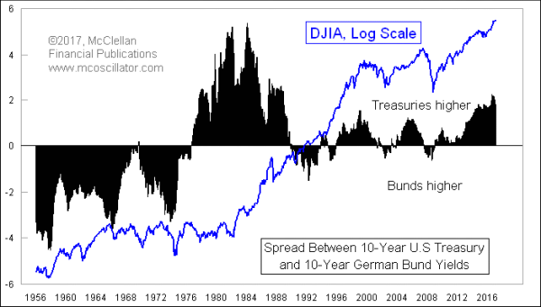
It is important to understand when using these insights that this relationship between the Treasury-Bund spread and stock prices has really only worked for about the last 30 years. Prior to the 1980s, it did not work at all. Here is a longer term chart:

We should remember that in the decades after World War II, Germany was still a rebuilding country, divided in two by the postwar agreement with the Soviet Union, and definitely not a favorable risk in terms of its sovereign debt. So its yields were understandably higher than those of U.S. debt. Then in the late 1970s and the 1980s, the Federal Reserve was fighting inflation that began with the 1973-74 Arab Oil embargo, using higher interest rates.
Only in the late 1980s did things settle down, and with the fall of the Berlin Wall in 1989, Germany came to be seen as a legitimate financial and industrial power, and a good risk in terms of its sovereign debt. And that is when this leading indication for stock prices began to work.
I was stationed with the US Army in Germany at the time the Berlin Wall came down, and the two Germanys reunited. It was obvious that it was a transformational moment in history, but I could not have known then that it would mean this change in how the yield spread would work as an indicator.
If we ever see a time when the yield on German bonds is higher than that of U.S. 10-year T-Notes, making a dip below zero in these charts, that will mark a great buying opportunity for the stock market, if the past 30 years’ experience is any guide. And a few months from now, we should see a major price top for the stock market, which the current divergence is just now starting to foretell.
Tom McClellan
Editor, The McClellan Market Report
Feb 23, 2017
Crude Oil Foretold the Trump Rally 10 Years Ago |
Apr 03, 2014
Bund Spread’s Message for the Stock Market |
May 12, 2017
China Is Pulling U.S. Bond Yields Higher |