A-D Line New High Limits Drawdowns
Free Chart In Focus email
Delivered to you every week
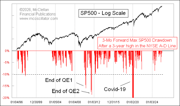
We have just seen a new all-time high in the NYSE's daily Advance-Decline (A-D) Line. It confirms the new highs in the major indices, and that is a really good thing.
Years ago, I undertook a study to see what it means to have a new high in the A-D Line. In order to increase my sample size, I specified that it had to be just a new 3-year high instead of all time, and then I looked at what the max drawdown was in the SP500 over the succeeding 3 months. The recent decades' results are shown in this week's lead chart.
The short version is that if you see a new A-D Line high, you have pretty good assurance that the biggest drawdown you are likely to see over the next 3 months is limited to about 10%. But the big caveat is that you can throw this rule out the window if the Federal Reserve or Congress puts a thumb on the scale.
After the bottom of the Great Financial Crisis (GFC) in March 2009, the Fed decided to throw money at the banking system with its first ever round of "Quantitative Easing" or QE1. They ended that suddenly in April 2010, and what followed came to be known as the "Flash Crash" on May 6-7, 2010, when liquidity dried up all at once and bids just disappeared. Some blue chip stocks traded for pennies, and those trades had to get wiped out by the stock exchanges.
The Fed honchos saw that they had not fully fixed the liquidity problems with QE1, and so they started QE2 in August 2010, and everything was great. Or at least it was great until the Fed once again ended QE2 very suddenly in June 2011, and we saw a 19% drop.
The FOMC learned its lesson, and when they decided to end QE3 in late 2014, they wisely "tapered" their slowdown of purchases of Treasury and mortgage debt. That allowed the banking system and the financial markets to adjust more slowly to the withdrawal symptoms. We still saw a market correction in 2015 because of ending QE3, but it was more muted.
We also had a big exception to the rule about new A-D Line highs back in 2020, when the arrival of Covid into the US led to a government shutdown. Remember "2 weeks to flatten the curve"? That brought a big drawdown in April 2020, which I named the "Covid Crash" and others took up that label. That was a genuine exception about the supposed assurance of limited drawdowns from a new A-D Line high.
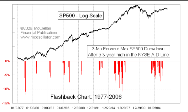
This principle has also worked further back in time. Here are a couple more charts looking back further in history, so that we can see that the chances of a big drawdown are pretty limited for at least 3 months after a new A-D Line high. Note that the big time gaps between the red drawdown bars reflect periods when there were not any new 3-year A-D Line highs.
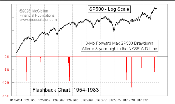
There was one notable exception in October 1978, when the SP500 saw a 13.5% drawdown. There was a dollar crisis then, thanks in part to rising inflation rates. It all came to a climax on Oct. 24, 1978, when President Carter announced a tougher anti-inflation program to stabilize prices and the currency. The SP500 was at 97.49 that day, and continued to fall further to a closing low of 92.49 on Nov. 14, 1978 before starting to rise again.
The key point to all of this historical analysis is that seeing a new A-D Line high is bullish news, and it offers us "some" assurance that we won't see a big ugly bear market for a while. The handful of exceptions help to illustrate how there are no guarantees in the financial markets, especially when folks in Washington, DC decide to try to "help".
Tom McClellan
Editor, The McClellan Market Report
Jun 05, 2014
A-D Line New High Offers Some Immunity |
Jan 23, 2025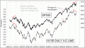
NYSE A-D Line Divergence |
Jul 28, 2022
JOLTS Data Following NYSE A-D Line Downward |