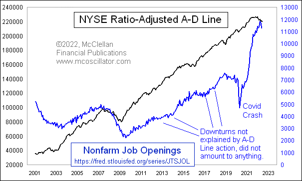
JOLTS Data Following NYSE A-D Line Downward
Free Chart In Focus email
Delivered to you every week
Starting in December 2000, the Bureau of Labor Statistics has published what it calls the Job Openings and Labor Turnover Survey (JOLTS). In simple terms, it is a measure of how many job openings there are.
It has been showing astounding growth ever since the Covid Crash in the spring of 2020. But just recently, it saw a peak in March 2022 at 11.8 million job openings, and as of May it is down to 11.2 million. The next JOLTS release is scheduled for August 2, 2022.
The point of this week’s chart is to show that the NYSE’s A-D Line has been telling us for a few months to expect a downturn in the JOLTS data. The two have a very strong correlation, not just in terms of the overall upward slope from the left end of the chart to the right, but also in terms of moving up and down together on shorter time frames. And the A-D Line often foretells the turns in JOLTS data.
Back in March 2009, the A-D Line bottomed four months ahead of the eventual JOLTS data bottom that came in July 2009. The A-D Line also showed strength in 2003 ahead of the JOLTS upturn that year. It is fair to note that the A-D Line did not foretell the drop in jobs listings during the Covid Crash, but I don’t think we should hold that against the A-D Line for missing that one.
On a month-end basis, the NYSE’s daily A-D Line peaked back in October 2021, and has moved downward pretty decisively. It has given us plenty of warning this time that liquidity was in trouble, in ways that would eventually come around and bite the jobs market in addition to the stock market.
Okay, you say, but what about the unemployment rate? Here is a comparison of the JOLTS numbers to the U-3 unemployment rate, which is the most commonly cited version.
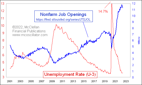
The two are obviously inverted, which is not a surprise. What is noteworthy is that the changes in slope for the JOLTS data tend to precede changes in the unemployment rate by a few months. Back in 2009, unemployment did not reach its peak until October 2009.
The key point here is that the unemployment rate tends to lag behind a lot of other economic data. So when you hear someone say that we cannot be in a recession yet because it is not showing up in the unemployment rate, you can be confident that such a person has no real idea how economics or statistics work. That can be a useful thing to know about an “expert”.
The NYSE’s A-D Line is still showing weakness, and does not appear to have bottomed yet in a meaningful way. That is another way of saying that liquidity is tight, and will make things difficult for the “real” economy to withstand a slowdown, especially with a Federal Reserve that is hiking rates aggressively in order to crimp liquidity even further.
Tom McClellan
Editor, The McClellan Market Report
May 09, 2019
JOLTS Data Stumble, but A-D Line Says Don’t Worry |
Mar 26, 2022
Unemployment Rate Will Turn Up |
May 28, 2020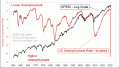
Unemployment Is Not “Good”, But It Is Bullish |