Anemic High-Yield Bond A-D Line
Free Chart In Focus email
Delivered to you every week
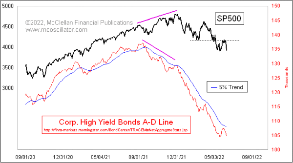
After making an oversold low on May 19, the SP500 had a pretty impressive rebound effort, which included 3 really strong breadth days on May 25-27, 2022. That got a lot of analysts talking about a “breadth thrust” signal of various flavors. But the SP500 bonked at a resistance level that had been a prior support level at the March 2022 lows, and after several days it has now fallen back away from that test of the resistance.
Breadth might have been really good looking for the NYSE stocks in late May, but it was pretty anemic looking for the stock market’s fellow travelers, the high yield corporate bonds. This week’s chart features a daily Advance-Decline Line for those bonds’ A-D data, which is published each day by FINRA. These bonds move a lot more like the stock market than like T-Bonds. What makes them even more interesting is that they tend to be terribly sensitive to liquidity, both good and bad, and so they function like the canaries in the coal mines of Newcastle a couple of centuries ago. They tell us when the conditions are great for stocks, and more importantly they tell us when liquidity is in short supply.
This High Yield Bond A-D Line did bounce higher along with the stock market in late May 2022, but it was a weak bounce that did not even make it to the 5% Trend line. That is an exponential moving average with a 5% smoothing constant. See this article. The message is that while the bulls were able to mount a decent 3-day bounce, it was done without a real return of strong liquidity, which means that there was not the fuel for a real uptrend.
Looking at this A-D Line longer term, we can see that it has shown us divergent top indications at all of the major tops where we would want to have that message.
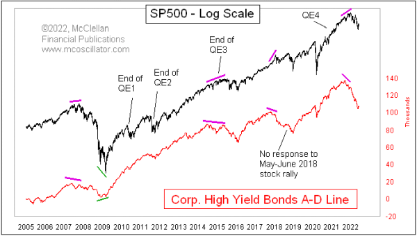
It also told us when things were looking iffy at the end of QE1 and QE2, that liquidity really was not a problem, and the market pretty quickly got over its troubles. The end of QE3 was a different story, however, and saw a more significant decline in the High Yield Bond A-D Line, indicating the liquidity problems that the financial system was suffering through then. And then in early 2016, this A-D Line shot higher to say that liquidity had somehow been restored.
This A-D Line also told us about the liquidity problems in 2018, when the Fed decided it would do some “quantitative tightening” or QT, shrinking its holdings of T-Bonds and mortgage backed securities (MBS). It showed no response when stock prices rallied in the summer of 2018, setting up the big decline in Q4 of that year.
It also told us about the big liquidity problems we are now facing, when it made a divergent top versus stock prices in late 2021. We have seen in 2022 what those liquidity problems have meant for the stock market, and thus far this A-D Line is not showing us an “all-clear” signal. There is more work yet for the market to do, to dismantle the excesses built up during QE4.
Tom McClellan
Editor, The McClellan Market Report
Jun 03, 2022
Flat M2 Growth Means Flat Period For Stocks |
Mar 11, 2022
Continued Weakness in High Yield Bonds |
Jun 06, 2019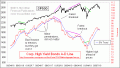
High Yield Bonds Back to Bullish Mode |