High Yield Bonds Back to Bullish Mode
Free Chart In Focus email
Delivered to you every week
The month of May 2019 gave us a scary-feeling selloff, as tariff worries gripped investors’ hearts. But it also showed that liquidity is not really in trouble, and now we have an affirmative sign that the bulls are back in charge.
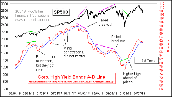
High yield bonds, sometimes known as “junk bonds”, trade more like stocks than like Treasury bonds. And they have proven to be ultra-sensitive to liquidity conditions, either positive or negative. They turn out to be really useful canaries in the stock market’s coal mine.
At the April 30, 2019 top for the SP500, we did not see a bearish divergence in the A-D Line for high yield bonds, which is the subject of this week’s chart. That is important, because this A-D Line has shown a remarkable ability to show us bearish divergences at the important price tops. We have since seen a slight dip below the 5% Trend (AKA a 39-day EMA), but this A-D Line has now recovered and moved back above that EMA.
That is important because this High Yield Bonds A-D Line gives important messages about the trend for stock prices based on its relationship with that 5% Trend. When it is above that EMA, it conveys a very bullish message. Going below it can be problematic, although the problems associated with such a move can often be delayed until after there is a bearish divergence compared to prices.
This next chart shows a very simple hypothetical trading system based on owning the SP500 (or not) depending on whether the High Yield Bond A-D Line is above or below its 5% Trend.
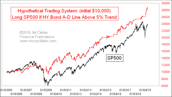
I am not proposing this as an actual trading system; any system based on one single factor is going to have problems. My purpose in showing it is to help demonstrate just how important this A-D Line’s strength or weakness is for stock prices.
Turning back to the top chart, in 2017 there were several dips below the 5% Trend, all of which were quickly reversed and the uptrend lived on. We have the same indication now in the current episode. In the absence of a divergence top condition, the interpretation is that we have just seen a normal corrective dip, and the uptrend is now back on. Liquidity is not the problem; tariff worries are. And that is an easier problem for the market to remedy.
Tom McClellan
Editor, The McClellan Market Report
Jan 24, 2019
Junk Bond Strength is Bullish For Stocks |
Mar 28, 2019
Bond CEF A-D Line Showing Big Strength |
Jan 17, 2019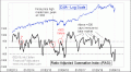
Countertrend Rally or New Uptrend? RASI Holds The Key |