When Underperformance Reaches An Extreme
Free Chart In Focus email
Delivered to you every week
When small cap stocks are outperforming on a relative basis, that is usually a bullish sign for the overall stock market. And small cap underperformance is usually a bad sign. This principle works because small cap stocks tend to be more sensitive to liquidity conditions, either good or bad. So when there is enough money around to lift the small caps, that means there is enough money to lift everything.
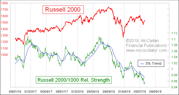
This week’s lead chart shows a very simple indicator, the relative strength ratio for the Russell 2000 versus its big-cap brother the Russell 1000 Index. It is calculated by taking one index’s value and dividing it by the other. When the line is rising, that means small caps are outperforming on a relative basis. That outperformance can mean going up faster, or going down slower. It is all relative.
This relative strength ratio was rising nicely early in 2019, but has been falling since mid-February. The overall stock market was still in an uptrend from that mid-February inflection point until the beginning of May, but that uptrend was at a shallower slope with the small caps underperforming. The sharp drop that led to the Russell 2000’s bottom on May 31 pulled this relative strength ratio down pretty far below its 5% Trend. So even though the relative strength line is still in a downtrend, it has gotten to an overextended state.
We can see that condition better with this next chart, which measures how far the relative strength line is away from its 5% Trend.
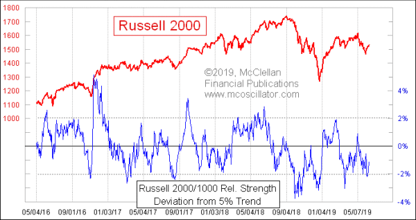
When this indicator gets outside of around +/-2%, it shows an extended condition, and perhaps an opportunity. It just showed us a -2.2% reading, meaning that the underperformance of small caps was perhaps overdone. Yes, it can get more overdone, as we saw in the ugly selloff during Q4 of 2018, but most of the time a -2% reading or below is an oversold opportunity.
I calculate these indicators in a spreadsheet, where I can do any math formulas I want to. For those who use standardized charting programs or web sites, you may not have that same flexibility. But you can still calculate these indicators pretty easily, using a couple of tricks. Here is how it is done on www.StockCharts.com:
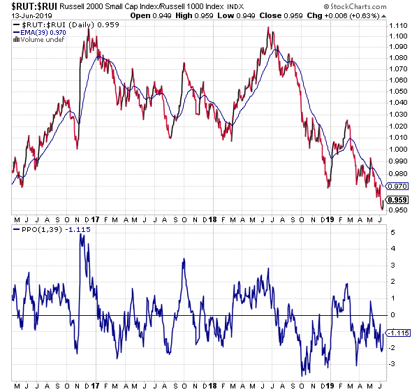
If you look closely, this plot matches the one in my chart above. What I did to create it was call up a chart of $RUT:$RUI, which is how to get a relative strength ratio of the two indices. To get the percentage deviation from the moving average, I add a Percentage Price Oscillator (PPO), and set the parameters to 1-day and 39-days. A 1-day moving average is the same thing as the daily close. And a 39-day EMA is the alternate nomenclature for a 5% Trend. I just prefer to use the originalist terminology, as discussed at this article in our Learning Center.
You can do this with any comparison of price indices, stocks, ETFs, etc. Whether you can get the same usefulness of overbought and oversold indications is a different question, and something you just have to look at to see if it is worthwhile.
Tom McClellan
Editor, The McClellan Market Report
Sep 06, 2018
DJIA/Gold Ratio |
Nov 29, 2018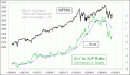
Consumer Discretionary Sector Shows Enormity of the Beat-Down |
Jul 06, 2012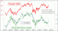
Relative Strength Can Sometimes Be Too Much of a Good Thing |