Architecture Billings Index Update

Free Chart In Focus email
Delivered to you every week
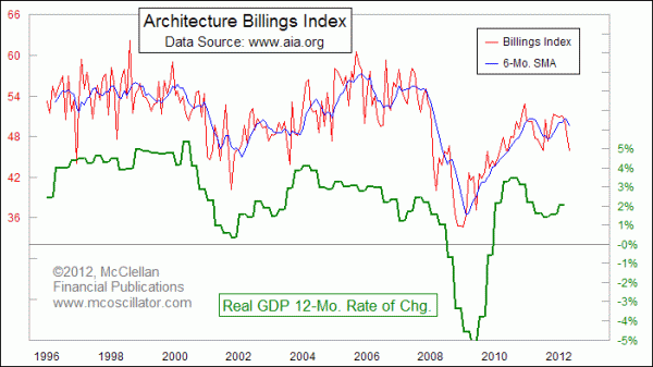
A year ago I introduced readers to a cool indicator with a still relatively small following, the Architecture Billings Index (ABI). At that time, the ABI was forecasting a slowdown in the growth rate of GDP, and that slowdown actually did materialize. Now, it is giving a similar warning that the growth rate for GDP in Q2 and perhaps in Q3 will be slower than we all might like.
The ABI is maintained and published by the Architects Institute of America, an industry group for architectural design firms. The AIA surveys member firms each month for changes in their actual dollar billings for work completed, as well as for "inquiries" from customers that have not yet turned into revenue generating work. Both series have quite a bit of month-to-month noise, and so some smoothing is needed to see between the wiggles.
The chart above shows both the raw value of the Architecture Billings Index and its 6-month simple moving average. The past 3 months have seen a sharp drop in the raw values, which is just now beginning to affect the moving average. The severity of the drop in the raw values is troubling, because it hints at a more drastic slowdown for the overall economy.
The Federal Reserve is evidently also sensing a coming slowdown in the indicators and data that the FOMC members watch. That committee voted his week to extend Operation Twist until the end of the year, and/or the end of their supply of short term Treasury debt to convert into longer term paper.
With this indication of an economic slowdown coming, it is tempting to want to use this data to generate some kind of idea of how big of a slowdown it might be. While there is some relationship between the magnitude of the movements of the ABI data and the resulting change in GDP growth, it is problematic to attempt to assign specific values to the response. The relationship is much better at describing the direction of the change in GDP growth than the size of the move, perhaps because all of the statistics that go into GDP are themselves problematic.
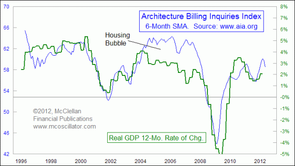
This next chart looks at the 6-month moving average of the ABI Inquiries Index overlaid with the real GDP growth rate, so that we can try to match scales. It works okay for the left end of the chart, but then the housing bubble in 2003-2007 skewed the data as more of the economic activity then was directed toward housing than at other times.

The two got back onto matching scales of movement during the big collapse in 2008, and have been close since then. The recent high in the Inquiries Index moving average was a bit above where GDP got to, perhaps owing to greater optimism than was warranted. Now the Inquiries Index data seem to be working to get back into sync.
Our long term cycles tools for unemployment rates show an upturn due now, and some rough times for job hunters in 2013-14, regardless of who gets elected in November. The ABI data seem to be saying that the economic slowdown is already getting underway, even though it has not yet shown up in the lagging data for GDP.
Tom McClellan
Editor, The McClellan Market Report
Jun 10, 2011
Architecture Billings Index Forecasts The Economy |
Nov 12, 2010
The Secret Driver of Unemployment |
Aug 13, 2010
Brightening Prospects For Employment |