As Goes January…? Really?
Free Chart In Focus email
Delivered to you every week
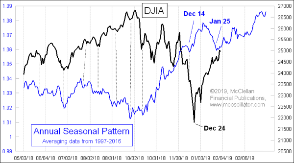
The stock market’s relationship to its normal seasonality has gotten wacky lately. October to December is supposed to be an up period for stock prices, and instead we saw a very sharp correction. In recent years, January has typically seen a meaningful decline, but the stock market instead powered higher. In fact, the DJIA’s 7.2% gain in January 2019 was the strongest January since 1989.
This makes for a good time to bring up the old idea of the “January Barometer”, which is the belief that the stock market’s behavior in the month of January is determinative of what it will do for the whole year. It is not to be confused with the “January Effect”, which is the tendency for small cap stocks to outperform in January.
The January Barometer was made famous by Yale Hirsch, of the Stock Traders Almanac. And there is some legitimacy to its billing as a harbinger of what is coming. But there are also problems with that.
Using data since 1928, the January Barometer has correctly predicted the DJIA’s return for the whole year 75.28% of the time. That sounds pretty good, until we realize that the DJIA has been up for the year 67% of the time over that period. So one could have just guessed “up” and come pretty close to the track record of the January Barometer.
One other problem with the January Barometer is that when you are standing on Jan. 31, and trying to figure out how to invest for the rest of the year, the water that has already flowed under the bridge is not much use to you. What you want is not something which is going to predict the whole year, but rather something that will help you with the rest of the year. And this is where the January Barometer comes up lacking.
A great example was the year 1987. The DJIA was up 13.8% for the month of January 1987. And the DJIA finished the whole year of 1987 up 2.3% from the last day of 1986. So the January Barometer was “right” about it being an up year, even though the DJIA lost 10% from the end of January to the end of December 1987.
Here is a fuller depiction of its track record:
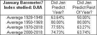
We can see in that table that the January Barometer had a pretty good run in the 1950s and 1960s, but since then it has not worked so well. And it is especially not so good when we look at what January says about the rest of the year, i.e. the other 11 months.
Here is a look at January performance versus the rest of the year (after January) on a scatterplot chart:
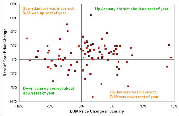
If the January Barometer was correct all of the time, then we would see a uniform arrangement of the dots from lower left to upper right. But instead we find a lot of dots in the upper left and lower right quadrants, meaning that the rest of the year did not match what January did.
Bottom line, it is great that we have seen such a nice rally off of the December 24, 2018 low, and a nice strong January. But don’t go counting your chickens about what that supposedly has to mean for the whole year.
See also David Keller’s article on this topic at https://stockcharts.com/articles/mindfulinvestor/2019/01/defrosting-the-markets-thoughts-on-the-january-barometer.html
And Jay Kaeppel wrote about it too at https://jayonthemarkets.com/2019/01/30/what-you-need-to-know-about-the-january-barometer/
Tom McClellan
Editor, The McClellan Market Report
Jan 04, 2019
Santa Claus’ Report Card Is In |
Aug 09, 2018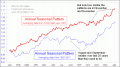
How Seasonality Has Changed |
May 18, 2018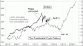
What Happened to the Presidential Cycle? |