Rainbow Convergence: Some Charting Magic

Free Chart In Focus email
Delivered to you every week
One of the chart features that I discuss quite often in my Daily Edition is what we call a “rainbow convergence”. It is named for the point on the chart where all of the pretty moving average type lines come together. Some of those indicators may be new to some readers, so you can get a quick tutorial on what they mean at this article.
A rainbow convergence can be important to watch because the way that prices behave as it is happening gives us information about what lies ahead. There are two types of price behavior at the moment of a convergence, each with a different meaning.
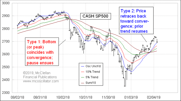
Type 1 involves prices making an accelerated move which brings about the convergence. A great example is shown in this week’s chart. When that happens, the moment of the convergence tends to mark an end to that short term move, and the entry into a pause. The mission of the pause is to test the blue Price Oscillator Unchanged line, and the outcome of that test governs whether the pause is just a rest break or instead is an outright reversal. In the case of that Oct. 2018 rainbow convergence, prices retraced back to the blue Price Oscillator Unchanged line, but not through it, and the down move resumed.
Type 2 happens when prices retrace back toward the price-time point of an impending rainbow convergence, but not through it, and the implication is that the trend which preceded the retracement should resume itself. This week’s chart also shows an example of that phenomenon, and sure enough the uptrend which preceded the retracement back toward the convergence was resumed after that retracement.
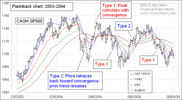
These two in the top chart are not the only instances of this phenomenon happening. Here is a chart of these indicators from 2003-04 which does a good job of illustrating that this is a durable phenomenon.

Interpreting an impending rainbow convergence is a little bit harder to do in real time. One has to watch what prices are doing as the moment of the convergence approaches. And it is always possible that a potential Type 2 retracement might actually keep going and cross through all of these lines, thereby negating the meaning of a retracement back toward the convergence. One has to watch out for that.
You can watch this phenomenon yourself, and you don’t need all four of these lines on the chart. The middle two are sufficient, and they are easily calculated in any charting platform. They are the 10% Trend and 5% Trend of closing prices. Some people would call those a 19-day Exponential Moving Average (EMA) and a 39-day EMA, but we prefer the originalist terminology for them coined by Pete Haurlan in the 1960s, when he introduced the use of EMAs for tracking stock prices. When those two EMAs cross, all of these lines cross, so for the purposes of tracking this phenomenon, they are sufficient.
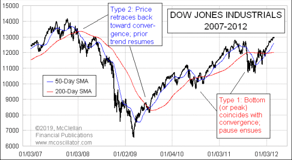
It is worth noting that this phenomenon is not exclusive to just these two EMAs. Here is the DJIA from 2007-12 with its 50-day Simple Moving Average (SMA) and its 200-day SMA:

I picked that period as an example because it has a nice collection of both types of convergences. When the 50-day and 200-day SMAs cross, some analysts call that a “Golden Cross” or a “Death Cross”, depending on if the 50 is going up or down through the 200. I have noted before that the Death Cross does not always live up to its hype as a bearish indication, and this point about the behavior at the time of the convergence helps us to understand why.
The same principle works for these two MAs. The behavior of prices at the time of the convergence tells us about what lies ahead. So a move that gets exhausted just as the lines are coming together is likely all done at that point. But a retracement back to the crossing point says that the preceding move should resume itself.
I have not tested all possible combinations of moving average speeds to see if it works everywhere; you’re welcome to do such testing if you wish.
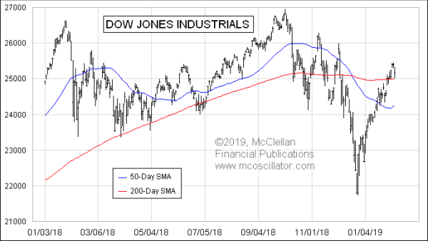
This principle of how to interpret a “Death Cross” did come up recently. The two MAs for the DJIA crossed on Dec, 19, 2018, just 3 trading days ahead of the Dec. 24 bottom. The big accelerated move which brought about the crossing ended at almost the exact moment of the convergence of those two SMAs.

So the key takeaway of this is that the meaning of two moving averages crossing is not always the same. It depends on what prices are doing at the moment of that crossing, and that is important to remember for anyone seeking to make such interpretations.
Tom McClellan
Editor, The McClellan Market Report
Nov 25, 2011
Rainbow Convergence Has Predictive Value |
Aug 19, 2011
Death Cross Does Not Live Up To Its Hype |
Jun 21, 2018
Bumpiness Signals Weakness |