Big Change In Bull-Bear Spread

Free Chart In Focus email
Delivered to you every week
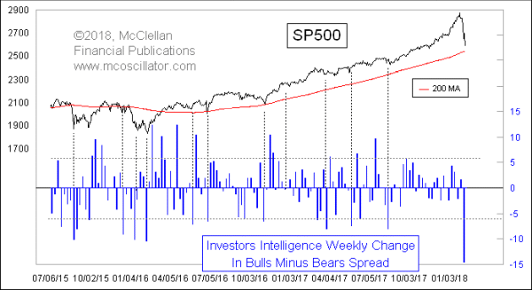
The latest data from Investors Intelligence showed a huge change this week. Bulls dropped from 66% to 54.4%, and bears rose from 12.6% to 15.5%. That means the spread between bulls and bears dropped by 14.5 percentage points, which is the biggest one-week drop since July 2011. Drops of more than 6 percentage points usually mark washout bottoms for prices.
That July 2011 drop in the bull-bear came as prices crashed down 19%, following the sudden cutoff of QE2. And there was a similar 14.5 percentage point drop in May 2010, the week of the Flash Crash which occurred after the sudden end of QE1. The Fed learned from its mistakes, and it wound down QE3 much more slowly.
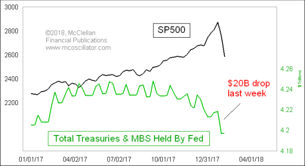
But all of that extra money was left within the banking system, and investors got used to the plentiful liquidity and low volatility that the excess liquidity brought. So now, when the Fed is starting to drain the bathtub, the smallest little drop in the Fed’s balance sheet has brought an outsized drop in stock prices, and a corresponding sudden drop in analyst bullishness.

The $10 billion per month in reduction of Federal Reserve holdings of T-Bonds and mortgage backed securities (MBS) which was in effect in Q4 of 2017 has now accelerated to a target of $20 billion a month for Q1 of 2018. But they did the month’s allotted drop all in one week at the end of January, setting up the illiquidity situation that the stock market is going through now.
The Investors Intelligence sentiment data is very sensitive to price movements. So it is natural that a big drop like what we have seen would bring a big drop in the bull-bear spread.

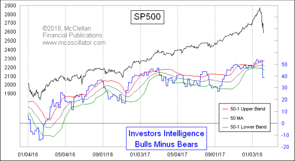
The change from the prior week takes the bull-bear spread down from above the upper 50-1 Bollinger Band to below the lower one. It is still not a “low” spread reading, meaning that the value is not as low as what we have seen at important price lows over the past 2 years. But it is a drop well below the lower band, which is where price lows are found. And the big one-week change suggests that the down move we have seen in stock prices is exhaustive, meriting a rebound.
Tom McClellan
Editor, The McClellan Market Report
Nov 14, 2014
More Good News for Employment |
Mar 23, 2016
Too Fast of a Sentiment Swing |
Jan 18, 2018
Ending How It Began (Parabolically)? |