Dallas Fed’s Signs of Recession
Free Chart In Focus email
Delivered to you every week
Last week, I compared rainfall in New York City to both the stock market and GDP growth. That would be just a great case of statistical whimsy, if not for the amazingly strong correlation in the data. Such a correlation does not come about just randomly.
This week, I want to share some economic data that will be more conventionally acceptable, and which also argues for an impending soft recession. Some people will just never accept rainfall as an economic indicator, which is their loss. But these are Dallas Fed generated numbers that will be more difficult for anyone to dismiss.
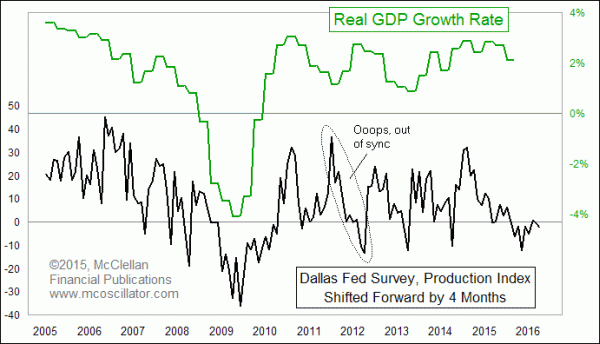
The Dallas Federal Reserve Bank publishes data on its survey of area business activity within its district. The data are available in Excel format directly here, or via their survey results page here. The chart above shows their Production Index compared to U.S. real GDP growth. As you might expect, I am doing my usual trick of shifting forward one of the data plots to reveal how the other one follows in the same footsteps after a bit of a lag. In this case, the Dallas Fed Survey’s Production Index is shown to lead real GDP growth by about 4 months.
That is important because this Production Index has been negative for 7 of the past 8 months. That sort of sustained negativity is reminiscent of what we saw back in 2008-09, although the severity of the negative readings is much less impressive this time. Still, it does point toward a continued downward move for GDP growth rates.
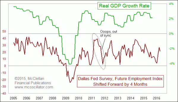
A similar message comes from another data series in the Dallas Fed Survey. This next chart shows their “Future Employment” Index. Its message is largely the same, and the same anomaly in 2011 shows up in this data series.
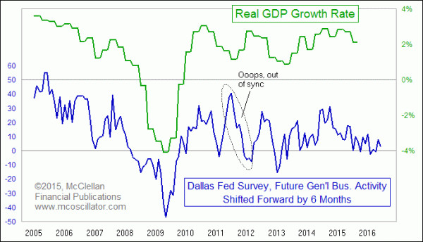
The final chart looks at the Dallas Fed’s index of “future general business activity”. In this case, I had to use a 6-month offset instead of 4 months to get the two plots to line up. It too shows a continuing weakening of the data, but not as bad as the 2008-09 episode.
One might reasonably argue that the Dallas Federal Reserve District is an overly small sample of U.S. economic activity, given that it encompasses only Texas, half of New Mexico, and half of Louisiana. It is a far smaller geographic area than the San Francisco Fed’s district, for example.
And one might also reasonably argue that the Texas-Louisiana economic data may be overly weighted in the energy sector, which has been hurt recently by low oil and methane prices. The run up to over $110/barrel and drop to $80/barrel in 2011 probably accounts for the anomaly in the Texas data. But I would note that falling oil prices were a big factor in 2008-09, as oil spiked up to $145/barrel and then crashed to $37/barrel during the commodity bubble and its bursting. Oil sales are part of GDP, and part of tax collections.
These arguments about the Dallas Fed’s unusual sampling of economic activity fall away once we see the performance of the data. These data series seem to have a demonstrated ability to model the future behavior of GDP growth, the 2011 anomaly notwithstanding. And the message for the immediate future is one of continued slowing of U.S. economic growth.
Tom McClellan
Editor, The McClellan Market Report
Dec 23, 2015
New York Weather Is Bearish |
Jan 17, 2015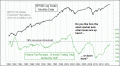
The 18% Recession Threshold |
Feb 19, 2015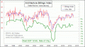
Architecture Billings Index Flashes Warning |