Discretionary vs. Staples

Free Chart In Focus email
Delivered to you every week
One easy way to evaluate investors' appetite for risk is to make a comparison of a couple of SPDR sector ETFs, XLY and XLP.
XLY is the ETF which tracks the "consumer discretionary" sector, as Standard and Poors defines it. XLY's top 5 holdings are Comcast, Walt Disney, Amazon.com, Home Depot, and McDonald's.
XLP tracks the "consumer staples" sector, with top holdings of Procter & Gamble, Coca-Cola, Philip Morris, Wal-Mart, and CVS Caremark.
The idea is that when investors are more open to accepting greater risk, they favor the stocks of the discretionary sector, featuring companies that consumers do not necessarily have to buy, but which they like to buy when the have the money. A trip to Disneyland is not a necessity, but it is fun.
Stocks of companies that sell stuff people need all the time are thought to have much more stable sales, and thus earnings, and so they can be seen as a refuge in times of economic turmoil. People are always going to need toilet paper and laundry detergent, regardless of what the banking system is doing.
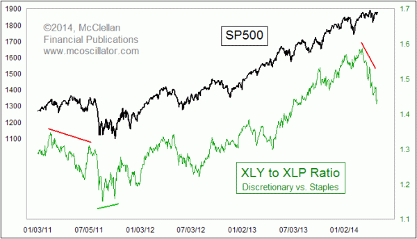
The easy way to track the relative performance of these sectors is with a simple relative strength ratio of the two ETFs' share prices, as is seen in the chart above. I take the share price of XLY, and divide it by XLP. When the line is moving upward, then the consumer discretionary stocks are outperforming on a relative basis. And it turns out that such a condition tends to be bullish for the market overall, as evidenced by the strong positive correlation between the two chart plots.
When the relative strength line moves downward, it is a sign of trouble for the stock market. And that sign of trouble can even start to appear before the final price top for the SP500, making a bearish divergence as it did in a couple of instances highlighted in the chart. It does not always give a divergence at every meaningful price top, but when it does then it is usually worth listening to.
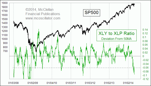
So with the relative strength line falling right now, that is a bearish indication for the stock market, right? Well, yes, but sometimes too much bearishness can be a bullish sign. The relative strength line has fallen hard in April 2014, and is arguably creating an oversold opportunity. We can see that even better in this next chart:

To create the indicator in this chart, I first calculate a 50-day simple moving average (50MA) of the XLY to XLP relative strength ratio featured in the top chart. Then I measure how far that relative strength ratio is away from its 50MA. Just recently, that spread has dropped to a deeply negative level, which is usually a sign of a bottom for the overall stock market. The message is that the bearishness causing investors to flee the consumer discretionary stocks may have gotten overdone.
It is worth noting that an oversold reading for this indicator did not halt the stock market's decline in 2008, a time when the Fed was actually shrinking its holdings of Treasuries in the face of the worst liquidity crisis in a generation. That is not the background condition we have now, with the Fed still inflating its Treasury and MBS holdings through "quantitative easing", and so unless one is willing to make the bet that the stock market now is somehow in another version of the 2008 bear market, it is much more likely that this oversold condition should get some traction.
Tom McClellan
Editor, The McClellan Market Report
Dec 19, 2013
A-D Line Divergence |
Jul 20, 2012
GE’s Share Price Has Message For Market |
Jul 06, 2012
Relative Strength Can Sometimes Be Too Much of a Good Thing |