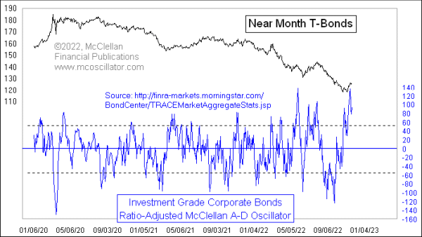
Extreme Reading on McClellan Oscillator for Bonds
Free Chart In Focus email
Delivered to you every week
After trending downward since the summer of 2020, T-Bond prices have seen a small upturn here in November 2022. That price rise for T-Bonds had coattails, helping to boost the prices of investment grade corporate bonds. One effect of those corporate bonds moving higher is that the Advance-Decline (A-D) data for them has also seen a sharp upturn, which has resulted in a really high reading for the McClellan Oscillator in this week’s chart.
The classic McClellan A-D Oscillator that my parents created back in 1969 was for the A-D data of the NYSE and AMEX exchanges, the two major stock exchanges at that time. But the same math can be applied to any type of A-D data.
In this case, I am showing a “Ratio-Adjusted” McClellan Oscillator (RAMO), meaning that I have adjusted the raw daily A-D data to reflect the changes in the number of issues traded over time. See this article for an explanation of the math.
What the McClellan Oscillator measures is the acceleration taking place in the raw A-D data. So when there is a big positive reading like the one we have just seen, it means there has just been a really strong upward acceleration. In the stock market, a super-high McClellan Oscillator reading can be a sign of strong new initiation of an uptrend, and a promise of more upward movement to come. But it does not seem to work that way for the corporate bond A-D data.
Very high readings in this particular RAMO are associated with topping events for T-Bond prices. That may not mean they top on the exact same day, but the point is that these are markers of price exhaustion.
Why the bond market works differently from the stock market in this respect is an interesting question, but not an essential one. Different markets do have different personalities in how their price movements happen. Just ask any commodities trader. We do not have to know why those differences occur in order to acknowledge that they are real.
The point we should take from this chart is that the slight upturn in bond prices has exhausted itself, and we are more likely to see the downtrend in bond prices resume, rather than this being the start of a new price uptrend for bonds.
Tom McClellan
Editor, The McClellan Market Report
Jun 17, 2022
Corporate Bonds Show Oversold Condition For T-Bonds |
Mar 26, 2022
Unemployment Rate Will Turn Up |
Sep 14, 2016
McClellan Oscillator for High Yield Bond A-D Data |