Understanding Correlation Coefficients
Free Chart In Focus email
Delivered to you every week
A lot of market analysts like to use Pearson’s Correlation Coefficient, because it is included in their software, and it is pretty easy. You can use it quite easily in any spreadsheet program. But just because a tool is accessible and easy to use does not mean that it is the right tool, or even a useful tool. By failing to understand how a correlation coefficient calculation works, an analyst can reach some bad conclusions. What follows is a brief course on what correlation coefficients do, and how we can be fooled by them.
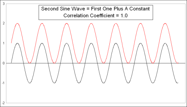
This week’s first chart presents a very simple comparison. I created a simple sine wave pattern, and then copied it to create another sine wave which equals the first one plus a constant. The two sine waves are identical, and not surprisingly the Pearson’s Correlation Coefficient is +1.0, even though they are at different numerical values. If we plotted every pair of data points on an X-Y chart, it would look like this:
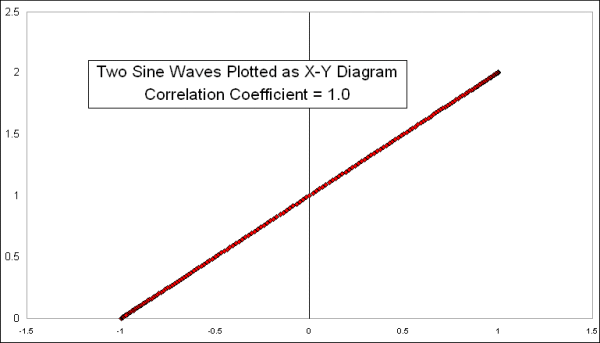
What a Pearson’s Correlation Coefficient is designed to measure is how much each pair of dots varies from a linear regression line drawn through the data. Since all of these data points are on the linear regression line, this comparison gets a perfect score of +1.0.
To make things a little bit more interesting, here are another two identical sine waves, but I modified one of them to change the amplitude of each half-cycle.
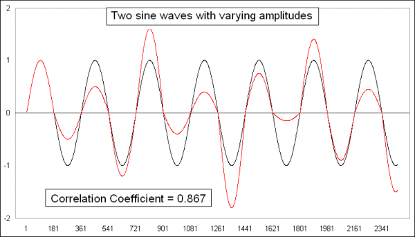
Not surprisingly, the correlation coefficient is still strongly positive, which should be the case since these sine waves are actually showing the same data, just tweaked a little bit. Plotting it on an X-Y chart shows a bit more of the differences:
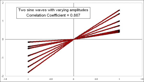
Because of the way I varied the amplitudes uniformly for each half-cycle, the result is straight lines for each half-cycle, but an overall spread for the “population” of values, meaning a lot more spread of some of the data points away from the ideal (but undrawn) linear regression line.
To make things a little bit more interesting, I took these last sine waves, one normal and one lopsided, and made one a little bit more lopsided by adding another sine wave to it with a different period.
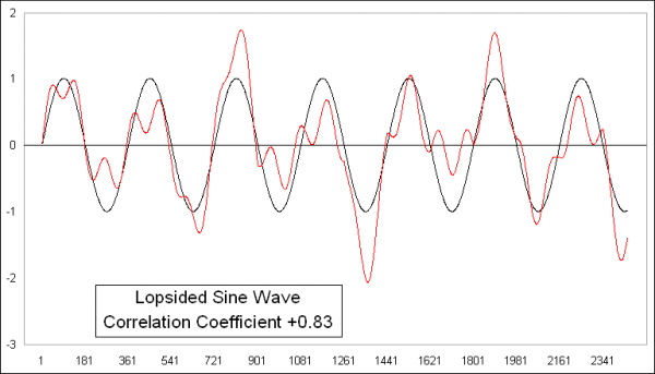
It should not be surprising that the Pearson’s Correlation Coefficient is still showing a strongly positive reading, because these two waves are still the same data, I just tweaked one of them a little bit. Here is their X-Y diagram:
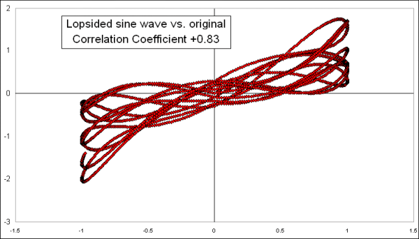
The overall pattern still shows us an arrangement of data points that is approximately linear which explains the high number, and going from lower left to upper right which explains the positive reading for the correlation coefficient.
One reason that all of these comparisons are still showing high correlations despite monkeying with the data is that I left the sine waves in a sideways configuration. If I add an uptrend or a downtrend, that changes the calculations a lot. Here are those last two plots with the same exact uptrend added to each of them:
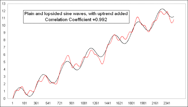
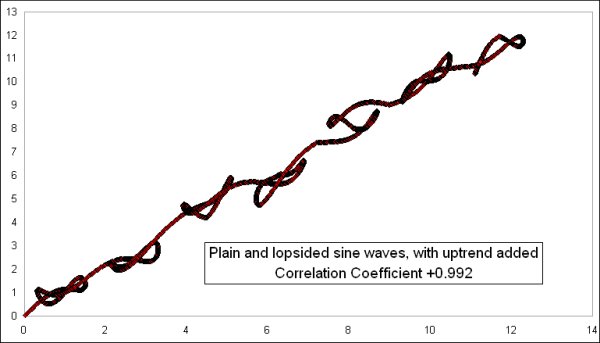
Adding the uptrend to both data sets takes the correlation coefficient up from +0.83 to an even higher +0.992. This is because the uptrend makes all the dots arrange themselves on the X-Y diagram in a much tighter looking straight line:
Now, it gets even more interesting if we make one of them trend downward. Here are the same two lines from the last comparison, except that I made the lopsided one trend downward while the conventional sine wave trends upward:
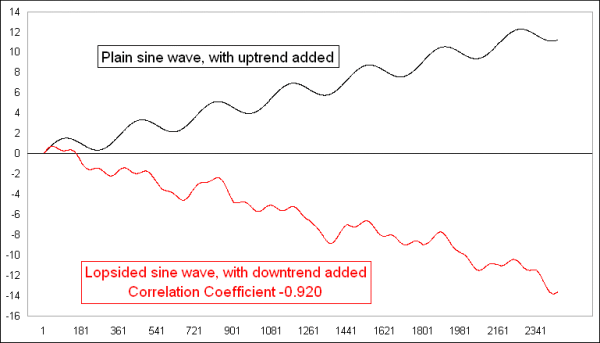
This flips the formerly strongly positive correlation coefficient to a strongly negative one. And that is in spite of the fact that the underlying sine waves are still in the data, and still dancing together. But having them dance together while trending apart changes the arrangement on the X-Y diagram to one that travels in a different direction:
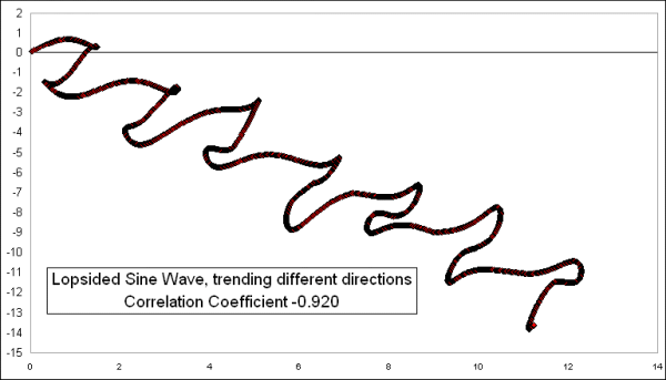
Having the X-Y plot move from upper left to lower right is what demonstrates that it is a negative correlation. So the number would say that they are in an inverse correlation.
Remember that these are the same two original sine waves which were once perfectly (positively) correlated, and which still move together in the short run, but adding a trend to the data dramatically affects the outcome of the calculation of the correlation coefficients. This is the key lesson for everyone to take from this, which is that the correlation coefficient gets changed dramatically by the trends in the data, and thus it is nearly always the wrong tool to use for time series data, because time series data show trending behavior. It can fool you into thinking that a correlation exists when it does not, or vice versa.
What the Pearson’s Correlation Coefficient statistical technique was originally intended for is to compare attributes among a sample population. If you were to measure 100 grown men, you would find that their height and their weight are positively correlated, though certainly not perfectly correlated. Another example is that the average temperature of a location is well correlated with its latitude, i.e. how far from the equator.
You could get some garbage results, though, if you were to try to calculate the correlation coefficient over the last 100 years between the CPI inflation rate and the DJIA. Inflation rates chop sideways, while the DJIA has trended upward (in the long run).
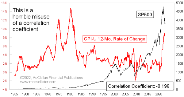
This would be an example of statistical malpractice, and would be a ridiculous exercise. But it can still be useful for making the point that while anyone can calculate a correlation coefficient on any two data series, that does not mean it will give you results you can do something with.
I recently shared on Twitter a chart comparing inflation numbers to sunspot counts. And while that might seem like a ridiculous pairing of data sets to compare, it actually shows a pretty obvious correlation:
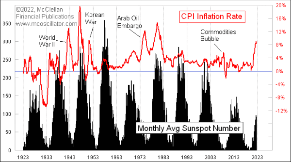
They go up and down together, although the amplitudes of the two data series do not always match up. Still, their joint cyclicality is pretty obvious. So are they “correlated”? Of course they are. But the pundits nevertheless responded by asking me for a correlation coefficient (which is +0.268, since I knew you were going to ask) because they cannot believe their own eyes without a number to make them feel better. And the points in history where the correlation was broken can be pretty easily explained, i.e. WWII, the Korean War, and the Arab Oil Embargo.
While a trend in a data set can interfere with calculations of correlation coefficients, under the right conditions that flaw can be turned into a useful feature. One good example of this was introduced to me several years ago by Jesse Felder, of www.thefelderreport.com. This next chart compares the SP500 to the VIX Index, and with just a 10-day lookback period.
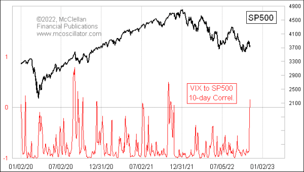
Most of the time, stock prices and the VIX move in opposition, and so this indicator will show a deeply negative reading, as it should. A falling stock market tends to bring a rising VIX, and vice versa. That is the normal condition.
But very infrequently, this 10-day correlation coefficient reading will jump up into positive territory, which is a statement that things are not operating in the normal way. A positive reading means that the two are trending together in the short term, instead of inversely. Having the VIX fall while prices are falling, or rise while prices are rising, is not normal, and it is a sign of a weird market. This sign most often appears at price tops, as divergences are forming and momentum is being lost, although there are exceptions.
The stock market in October 2022 attempted another rebound effort, and that price rebound was accompanied by a falling VIX, which is the normal condition. But now the VIX is correlating slightly positively with stocks, which says that the rebound effort is wobbling, and will likely fail.
Bottom Line: Just because your software gives you a cool statistical tool to use does not mean that it is necessarily “useful”. But tuning the correlation coefficient to a useful lookback period can sometimes produce useful insights.
Tom McClellan
Editor, The McClellan Market Report
Jul 14, 2021
A Useful Misuse of Correlation Coefficient with VIX Index |
May 16, 2019
On the Fickle Correlation Between Stocks and Oil Prices |
Aug 06, 2010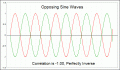
Correlations May Not Be What They Seem |