Gold Breakdown
Free Chart In Focus email
Delivered to you every week
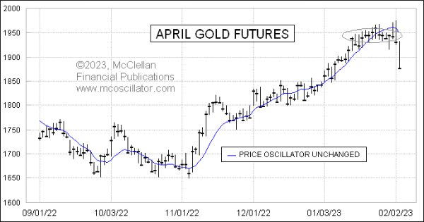
I wrote last week about how the Price Oscillator for gold futures had gotten up to a really high level and turned down, which was a bearish signal. It has taken a while for that signal to come to fruition, and gold prices even threw us a great head-fake just to see who could be fooled. But the signal’s payoff finally arrived on Feb. 3, 2023, thanks to a strong employment report.
This week’s chart shows just the daily price bars for gold with one indicator, the Price Oscillator Unchanged line. It represents the price level at which a hypothetical close would make the Price Oscillator (as discussed last week) be exactly at the same level as the day before. So a close above that line means the Price Oscillator will rise, while a close below it means that the Price Oscillator falls.
We first saw a close below that line back on Jan. 26, 2023, but that signal did not immediately lead to prices starting to fall. Gold prices have been stuck in a very tight trading range, at around the 1945 level based on April gold futures. Gold prices would wander around some intraday, but always seemed to find their way back to that same level at settlement time.
This stability first started to weaken with the FOMC meeting reaction starting on Feb. 1, 2023, which saw gold prices jump higher. And this helps illustrate an important principle of price behavior. When prices get extremely stable as gold prices did, the natural inclination is for the prices to seek to restore the normal level of instability. So like a spinning top that slows and is eventually going to fall over, the first sign of instability is a “wobble”. But the first wobble is not always the genuine one.
Gold prices wobbled higher out of that tight range of closing prices, but that was the fake-out move. Now with the Feb. 3, 2023 reaction to the jobs report numbers, we are seeing the true nature of the collapse out of stability, which was the big drop that is the fulfillment of the signal of the Price Oscillator turning down a week prior.
The important lesson to take from this is about the wobble, something that I addressed concerning the VIX Index back in 2014. It is tempting to see that first move out of a tight, stable range as a “breakout” which should be chased. But it can very well be just the misdirected wobble which pulls in the weak and eager traders, just so the market can laugh as it fools them.
Tom McClellan
Editor, The McClellan Market Report
Jan 27, 2023
Gold’s Price Oscillator |
Jun 12, 2014
VIX Below 12! |
Jul 15, 2022
Wild Times for the Copper/Gold Ratio |