Golden Cross Carries Some Little-Known Magic
Free Chart In Focus email
Delivered to you every week
On Feb. 2, 2023, the SP500 completed what is known by technical analysts as a “Golden Cross”, which is when the 50-day simple moving average crosses above the 200-day. It has an okay but not amazing track record of catching the big trending moves, although as with any trend-following system there are some bad signals.
I want to introduce you this week to another way of looking at the Golden Cross, and its supposedly evil twin the Death Cross (which is when the MAs cross going the other way). The key insight is about what is happening with prices at the moment of the crossing. What I have noticed over the years is that the behavior of prices at that moment will tell us something about what happens next to prices.
This is related to the principle known as a “rainbow convergence”, something I talk about a lot in my Daily Edition concerning shorter term exponential moving averages (EMAs), and which I addressed in a February 2019 Chart In Focus article. And this same principle works with other pairings of moving averages, including the 50 and 200 day simple moving averages.
In a Type 1 crossing (or Type 1 rainbow convergence), prices are extended pretty far away from the price point of the moving average crossover. In those cases, the moment of the crossing most often marks a reversal point. It can be a temporary reversal, or a more significant one.
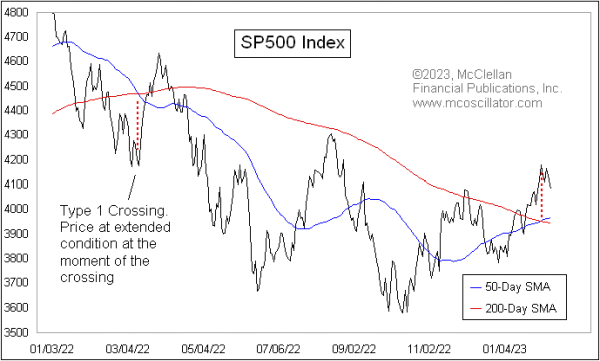
We can see an example of a Type 1 convergence in the chart above, when there was a crossover back in March 2022. That was a so-called Death Cross, which is supposed to be a bearish sign. But instead of living up to that bad omen right away, prices reversed at the moment of the convergence and mounted an 11% countertrend rally. Eventually prices turned back down again from that countertrend rally, and did finally live up to the bearish signal of the Death Cross, but it was unpleasant at first for those who saw that Death Cross as an immediate bearish signal and took action based on it.
There is a second type of behavior at the moment of the crossing that I call a Type 2 event. It involves seeing prices retrace back toward the price-time point of the MA crossing, and what usually ensues is a resumption of the trend that preceded the retracement.
The chart below takes a longer look at the SP500 with examples of both Type 1 and Type 2 events.
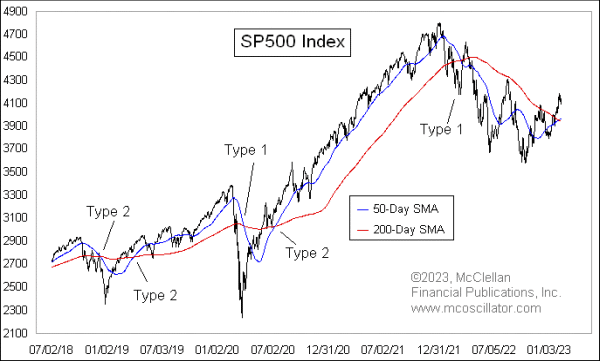
Looking closely, we see that when there is a Type 2 crossing, and prices retrace back toward the crossing point, the trend resumes after that retracement. But when there is a Type 1, more often there is a reversal, at least temporarily. This is the key insight: the immediate meaning of the Golden Cross or the Death Cross is different depending on how prices are behaving when the crossing is happening.
That brings us to the current crossing that happened on Feb. 2, 2023. In this case, that day marked the exact top of the recent up move, and prices are reversing downward, as opposed to manifesting the supposedly bullish implications of the Golden Cross.
It does not always work out quite this precisely. For example, the price bottom of the Covid Crash on March 23, 2020 was a week before the crossing of the two MAs, but that is still pretty close in time. And that was a pretty dramatic Type 1 crossing event that sure enough brought a reversal, which in that case was a permanent reversal and not just a temporary one.
I have seen this principle work with other pairings of moving averages, although I have not spent the time to test every possible combination to see how universal it is. If you have a different pairing of simple moving averages (SMAs) or exponential ones (EMAs) that you like to use, I encourage you to test out this idea to see if it works for them, as opposed to just assuming that it will.
And then the next time you hear an analyst talking about a Golden Cross or a Death Cross and claiming that it means a bullish or a bearish message, take a look first to see how prices are behaving relative to that crossing point. Because now you know about the special magic message embedded in that information.
Tom McClellan
Editor, The McClellan Market Report
Feb 07, 2019
Rainbow Convergence: Some Charting Magic |
Sep 08, 2022
A Rainbow Convergence and a Head and Shoulders |
Aug 19, 2011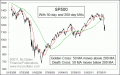
Death Cross Does Not Live Up To Its Hype |