Gold’s Price Oscillator
Free Chart In Focus email
Delivered to you every week
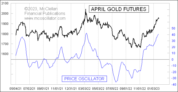
The McClellan Price Oscillator for gold futures prices has reached a pretty high level, equivalent to what it did at the price top in March 2022, and it has just now turned down. This is a bearish signal and could set off a pretty big pullback.
The McClellan Price Oscillator is a cousin of the more famous McClellan A-D Oscillator. My parents created both of these back in 1969. That research grew out of their desire to get a better signal than could be gotten from looking just at moving averages alone. Together, they wondered about finding the difference between two moving averages, and this was well ahead of when Gerald Appel did the same thing with his Moving Average Convergence-Divergence (MACD) indicator.
A McClellan Price Oscillator employs prices for any stock, index, commodity, or futures price series. One calculates two exponential moving averages (EMAs), known as the 10% Trend and 5% Trend. Those percentage numbers refer to the “smoothing constant” used in the calculation of each EMA. The smoothing constant governs how much weight is given to the most recent data, so for calculating a 10% Trend you would multiply today’s closing price by 10%, and then add that to 90% of yesterday’s 10% Trend value. A larger smoothing constant means a faster response to price movements.
The chart below shows the 10% Trend (red) and 5% Trend (green) for the April gold futures contract. The fact that they have become spread far apart is another way of saying that the Price Oscillator has risen to a high value, because the Price Oscillator represents the distance between those two EMAs.
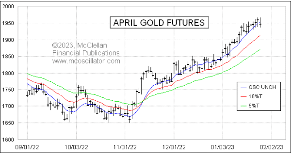
This chart also shows an additional line, the blue Price Oscillator Unchanged line. It represents the theoretical closing price at which a close on the next day would mean that the Price Oscillator stays at exactly the same value as the day before. It is calculated simply as the 10% Trend plus the value of the Price Oscillator. In other words, the blue line is the same distance away from the red line as the distance that the green line is separated from the red line. I like to use the Price Oscillator Unchanged level as a trigger level, especially when we see a very extended Price Oscillator value. But it does not work all the time that a drop below that blue line ends up being a good sell signal. It matters more with an overbought condition.
Because the 10% Trend and 5% Trend are tied to price levels, the amplitudes of the Price Oscillator are also going to be sensitive to price levels. Saying it another way, the higher the price goes, the bigger the swings we will see on the Price Oscillator. That does not matter much for short term analyses, but when one wants to do a long term comparison it can matter a lot.
One way to compensate for that is what we call the Proportional Price Oscillator, or PPO. It is shown in this next chart:
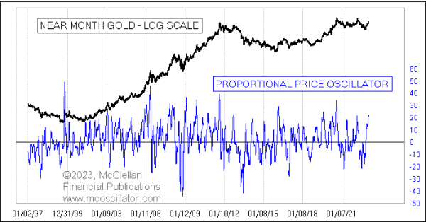
It is calculated by taking the value of the Price Oscillator, and dividing it by the closing price, which factors out the change in price levels over time. For this chart, I go one additional step, multiplying the PPO by 1000 just to make the Y-axis values more meaningful.
What we can see from this long term chart is that the current value of the PPO is not the highest ever, but it is still up pretty high, which merits a significant pullback in gold prices just to unstretch the rubber band and set up for the next potential up move. Such pullbacks usually continue until the Price Oscillator (and thus the PPO) gets down close to zero or even below it.
Tom McClellan
Editor, The McClellan Market Report
Feb 07, 2019
Rainbow Convergence: Some Charting Magic |
Nov 13, 2020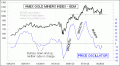
Bumpy Price Oscillator in GDM |
Mar 11, 2011
DJIA Price Oscillator |