New York Rain and GDP Data
Free Chart In Focus email
Delivered to you every week
I wrote here back in November 2024 about the seemingly silly correlation between rainfall in New York City and the behavior of stock prices. It does seem like a silly correlation, but it is also an amazing one which has been "working" for decades. After a while, if something keeps working, then I try hard to get over my preconceived notions about whether it is a correlation which is appropriate to exist.
This week I want to take that same analysis in a related direction, comparing New York City rainfall to US GDP. Here again, the human brain might reasonably conclude that no such relationship should be able to exist. But then the chart says it does exist, so if our brains cannot handle that reality then our brains are what need adjustment.
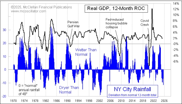
The latest GDP data just released on Aug. 28, 2025 showed an upward revision to Q2 2025 GDP, with it growing in these latest data at a 3.3% annualized rate versus the 3.0% growth rate in the preliminary estimate. That is for nominal GDP. The chart above shows the GDP data in a slightly different way, using "real" GDP (adjusted for inflation), and comparing each quarter's number to that of 12 months prior. This measure of GDP has been declining slightly in recent quarters from the high it made in Q3 of 2023, but it is still above zero showing positive GDP growth.
That slight decline in the positive growth rate of real GDP matches a shift which has been occurring in NY City weather, where there has been less rainfall than average lately. We do not yet know what the GDP numbers are going to be for Q3 of 2025, but the implication here is that lower rainfall points to a continuing drop for real GDP. June through August 2025 have been dryer than normal in New York City.
It is important to note that this relationship is not good enough to allow us to forecast the GDP numbers themselves. It only tells us about the direction of travel, and the timing of the turns. How far the GDP numbers go can vary a lot versus what the NY City rainfall data show. We also have to remember that exogenous events like Covid in 2020, or the Persian Gulf War in 1990-91, can come along to disrupt the nice correlation for a while, and then the world returns to normal again.
Whenever I show an interesting correlation like this, "helpful" readers like to send me examples of ridiculous correlations, like comparing US ice cream sales to the murder rate in India. These comparisons typically show 10 sets of data points. What these helpful readers do not seem to understand is that if you take 10,000 sets of data with 10 data points each, you are certain to find ones that seem to match up. It is like going to a Yankees game, surveying everyone in the crowd, and encountering someone with your same birthday. It is going to happen.
On this point, please note that the chart above shows 665 data points for each plot. Sample size really does matter. And the correlation extends back in time even before the period shown in this chart.
I also get readers asking what the correlation coefficient is for data sets I am comparing. This too arises out of a genuine concern for making legitimate comparisons, but at the same time out of ignorance about how statistics works. Pearson's Correlation Coefficient is the wrong statistical tool to use for time series data, because it can get fooled by trends. Please see the linked article below for amplification on this topic.
I do not know why the rainfall variability in New York City is so well correlated with US GDP. It would be fun if we could know, but it is not a requirement. I don't know why gravity works, but I am confident that it does, because I have seen (and experienced) enough data. The most recent data on rainfall are arguing for weaker GDP numbers in Q3.
Tom McClellan
Editor, The McClellan Market Report
Nov 07, 2024
New York Rain and Stocks - - Silly, But Accurate |
Aug 06, 2010
Correlations May Not Be What They Seem |
May 20, 2011
NY Investors Should Learn To Like The Rain |