No Bullish Message Yet From Bond CEF A-D Line
Free Chart In Focus email
Delivered to you every week
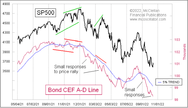
As stock prices were rebounding strongly on Oct. 13 from an initial bad reaction to CPI data, there was no confirmation of that price strength from the bond-related closed end funds (CEFs) which trade on the NYSE. These issues are often blamed for supposedly contaminating the composite Advance-Decline (A-D) data, but that criticism only comes from people who have not looked at the actual data.
I generate these data myself, because I find that they are terribly useful. The Bond CEFs are perhaps even more sensitive to good or bad liquidity than the actual common stocks are, and as such they function like the canaries in the coal mines of Newcastle 200 years ago. Those small birds were more sensitive to bad gases than the big burly coal miners, and so if they were noticed to be dead in their cages, that was a warning for the miners to get out of the mineshaft.
The Bond CEF A-D Line showed us a bearish divergence in late 2021 even before the divergence that came in the NYSE’s composite A-D Line. These bond-related issues did their jobs then as canaries.
During the bear market of 2022, the Bond CEF A-D Line has continued to point the way lower for the stock market. And it has further functioned to tell us liquidity is still poor when there have been countertrend rallies in the major averages that got no confirmation from the Bond CEF A-D Line. The SP500 and this A-D Line did move up together from the June 2022 low into August, but then the Bond CEF A-D Line went back to telling us that liquidity was poor.
This is all relevant right now because even with a pretty stunning intraday reversal on Oct. 13 for the SP500, the Bond CEF A-D Line still managed to close down and make a lower low. That says the price pop was not liquidity-driven. Pops that are driven solely by mood, without a backing of strong liquidity, tend to fizzle pretty quickly.
The Bond CEF A-D Line has served in a similar way in the past, giving us messages of strength that refuted some price weakness. Here is a longer term chart:
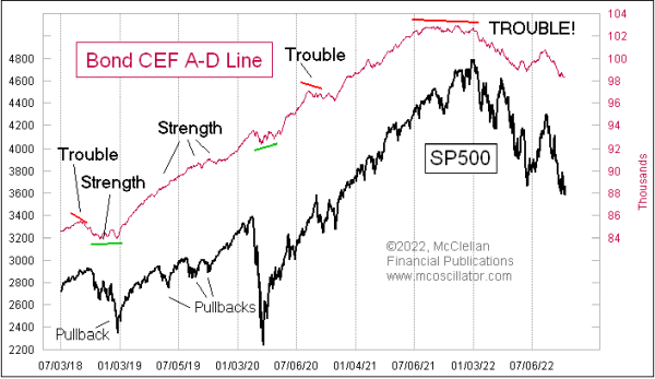
Notice the bullish divergence at the December 2018 price low, seen at the left end of the chart. And during the scary-feeling pullbacks in 2019, the Bond CEF A-D Line carried on as if there was nothing wrong, which later turned out to be the case and stock prices recovered.
The Bond CEF A-D Line did fall some in early 2020 with the Covid Crash, when everything was falling, but it quickly got back to trending higher, telling us that liquidity was just fine. It did give a message of liquidity problems in the fall of 2020, and sure enough the stock market went through some wild gyrations then. But the Bond CEF A-D Line quickly went back to trending higher, saying that liquidity was back to being happy and well.
That is not the message we are getting now. This should not be a surprise, with the Fed raising rates faster than ever before, and also selling off its Treasuries and mortgage backed securities. Those two efforts together are putting a big hurt on financial market liquidity, and the Bond CEF A-D Line is properly reflecting that. Prices can bounce around with traders’ moods, but the message from the liquidity canaries is that there are still problems.
Tom McClellan
Editor, The McClellan Market Report
Jan 13, 2022
Bond CEF A-D Line Showing Liquidity Problems |
Jul 28, 2022
JOLTS Data Following NYSE A-D Line Downward |
Jun 10, 2022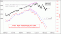
Anemic High-Yield Bond A-D Line |