Price = Sentiment
Free Chart In Focus email
Delivered to you every week
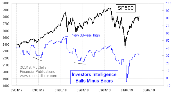
Most of the behavior of market sentiment indicators is driven by what prices do. This week’s chart is a case in point, showing the spread between the bullish and bearish percentages as reported by Investors Intelligence. The attribute of these data that I want to call attention to is how closely this bull-bear spread resembles the price action of the SP500.
There is a slight lag in that resemblance, owing to the data tabulation and reporting lags inherent to publishing any surveys of how people are thinking. The newsletter writers and investment advisors have to first form their opinions, then publish them, and then the staff of Investors Intelligence has to add up what their survey pool members are saying, and finally report it.
So for example, we saw the spread go negative as of their Jan. 2, 2019 report. But stock prices had hit their low a full week before, on Dec. 24, 2018. Other peaks and bottoms in both chart plots show a similar lag.
This point about prices and sentiment moving together also works on a longer term time frame. Here is a chart going back to 2006, and in order to de-trend the SP500 price data, I have portrayed it as the percentage deviation from its 200-day simple moving average:
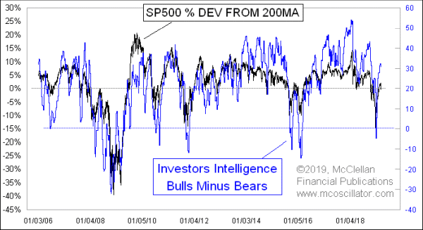
It is pretty easy to see in this chart that the two plots move mostly together. The additional interesting observation about the Investors Intelligence data comes from the scaling of both plots. I adjusted the scaling for each Y-axis in order to achieve the best overall fit of the ranges of the data. What resulted was a zero line for the SP500 plot which is at +20% for the bull-bear spread. That’s another way of saying that over the long run, there is about a 20 percentage point bias to the bullish side in the bull-bear spread data.
So if sentiment is really just a reflection of price action, then what good is it as an indicator? There are two answers. First, sentiment indicators can get to readings which are demonstrably extended compared to their normal range, and in doing that they can help us portray an extended market condition.
The second answer is a little bit more subtle, and harder to tease out of the data. What we would really like to see is instances of sentiment moving in ways which are not explained by price action. I call that “organic” sentiment as opposed to “induced” sentiment. In the top chart above, I have highlighted a couple of instances when the bull-bear spread made a lower low even as prices made a higher low. What that means is that bullishness declined far more than prices suggested should have happened, and so that means there was worry which was happening on its own. That’s the best kind of worry, because it is the easiest to reverse, and to turn into fuel for the rally.
Tom McClellan
Editor, The McClellan Market Report
Nov 29, 2018
Consumer Discretionary Sector Shows Enormity of the Beat-Down |
Aug 02, 2018
Investors Intelligence Bull-Bear Spread |
Dec 15, 2017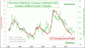
Confidence, and What Comes With It |