Rising New Lows In The Nasdaq

Free Chart In Focus email
Delivered to you every week
There are certain relationships which work "normally" most of the time, and when they are working that way it is not very remarkable. But when the normal relationship breaks down and starts acting differently, that gets our attention.
This week's chart shows us that the numbers of Nasdaq stocks making 52-week New Lows has been ramping up higher recently. That is not the normal thing to see while prices are continuing to push to higher highs. The normal relationship is that when prices are higher, New Lows go down, and then during a selloff these numbers spike higher. And since 2022 that relationship has been working that way for the most part. That is, until late 2024 as the chart highlights.
We saw a similar ramp higher in Nasdaq New Lows back in late 2021, just before the bear market of 2022. This does not mean that we have to get the exact same outcome this time. But it does serve as a warning that things are not acting normally, at least for these data.
When most people think of "market breadth", they think of Advance-Decline (A-D) statistics. But New Highs (NH) and New Lows (NL) is another way of looking at getting information from the broad list of stocks as opposed to just looking at the capitalization-weighted price indices. For A-D data, I do not give much weighting to the Nasdaq's A-D Line because it has such a persistent negative bias. The Nasdaq has looser listing standards than the NYSE, and so stocks which are going to IPO then go broke are more likely to do that on the Nasdaq than on the NYSE. And this skews the A-D stats over time.
Some technical analysts like to look at NH minus NL, but I find that not to be helpful. I would much rather look at just NH or just NL, so that the result does not get skewed by price surges up or down.
A stock making a new 52-week price low is a stock that is in a downtrend. So if you want to know about how the bottom of the roster is doing, then comparing that number to the 52-week NH number will contaminate the message. That is why the chart above shows just the NL data.
One other interesting point about NH and NL data. Many years ago, the data were tabulated differently. Before computers, clerks used to keep track of the price history for each stock using paper ledgers, and they had a different ledger for each stock and for each calendar year. So the stats that were reported for NH and NL were really about whether a stock was making a new high or low for the calendar year. This methodology would understandably get into trouble in early January, when there was not much history to compare to. So the statisticians would include the prior year's histories for a while, then around April each year they would switch to using just the new year's ledgers. This meant that the lookback period for evaluating whether a stock was making a new high or new low ranged from 4 months to 16 months.
That all changed in 1980, when computers allowed the statisticians to switch to a more uniform 52-week rolling lookback period, which is the method used to this day. There are data for NH and NL before 1980, but they are not comparable to the data from the post-1980 methodology.
If tinkering around with the NH-NL data for the Nasdaq and NYSE is something you are interested in doing yourself, we make a data file available for purchase at https://www.mcoscillator.com/subscriptions/signup/historical-data/.
Tom McClellan
Editor, The McClellan Market Report
May 25, 2023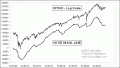
Why I Don’t Track the NH-NL Line |
Oct 11, 2013
New Highs’ Divergence |
Nov 27, 2019
Nasdaq A-D Line Lagging, Does Not Matter |