Small Cap Leadership Is A Good Thing
Free Chart In Focus email
Delivered to you every week
The "January Effect" is said to be a tendency of small cap stocks to outperform large caps as a new year gets started. It was originally thought to be caused by money coming back into small cap stocks following an exit in December for tax loss harvesting. In recent years, the January Effect seems to be occurring earlier and earlier, and it appears to have commenced this year in early December, casting doubt on the tax loss theory of cause and effect.
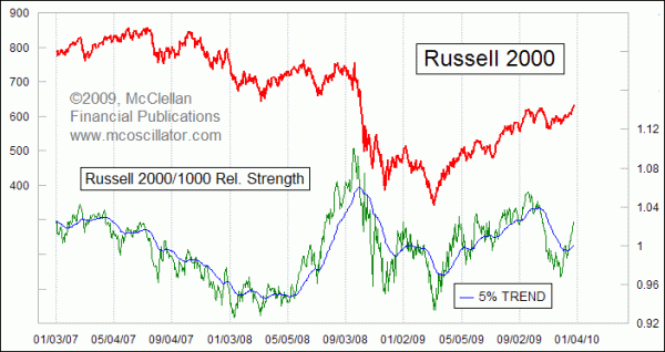
This week's chart shows a very simple relative strength indicator. The lower line in the chart reflects the ratio between the Russell 2000 Index and the Russell 1000. The Frank Russell Company determines the top 3000 US stocks in terms of market capitalization, and rebalances the list each June. It then separates those stocks into the Russell 1000 (the biggest capitalization of the whole 3000), and the Russell 2000 which is made up of the stocks ranked 1001-3000.
This relative strength ratio reflects the difference in relative performance between these major capitalization segments. The same technique can be used for any two indices, or for one stock compared to another stock or index.
Shown along with the relative strength index is its 5% Trend, which is also sometimes known as a 39-day EMA. See EMAs vs SMAs.
If you look closely, you can see that when the relative strength line is above its 5% Trend, that is usually a good time for the Russell 2000 Index to be going up. A rising relative strength line means that the Russell 2000 is outperforming the Russell 1000 on a relative basis, either by going up faster or going down more slowly. Usually, such outperformance comes from the Russell 2000 going up faster, due to the higher "beta" of small cap stocks.
It also turns out that when the Russell 2000 Index is doing relatively better, that is usually a good time for the Russell 1000 to be going up. In other words, the overall market does the best when small caps are leading, and that is the condition we find right now.
It is worth noticing that the relative strength line has moved well above its 5% Trend. That creates a bit of an overbought situation for the Russell 2000 Index. This is best seen in this next chart, which has an indicator reflecting the distance between the relative strength line and its 5% Trend.
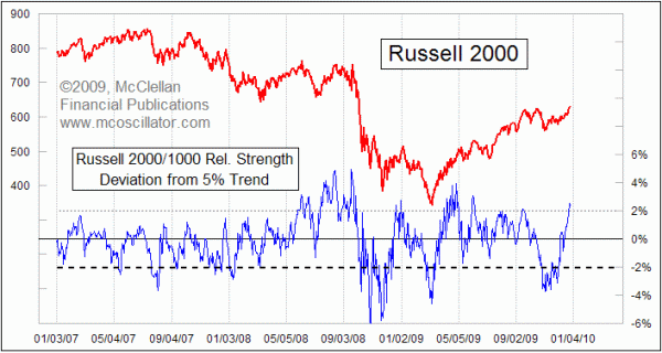
Of interest is the fact that when this indicator gets down below -2%, it is a pretty good sign of a price bottom for the Russell 2000 Index. But when it gets above +2%, the meaning is not the same; an overbought condition is often seen at the initiation point of a strong and persistent uptrend. Also, uptrends typically end with this 5% Trend Deviation indicator at a divergent lower high than the initial overbought high seen at the kickoff of the uptrend.
Making a new arrival at an overbought indication therefore means that the market likely has further to run upward from here. That presumption is confirmed by the fact that the NYSE A-D Line has made a new all-time high, meaning that liquidity is plentiful. As we enter the normally bearish second year of a presidential term, we should expect that the market may see some trouble down the road. For now, however, the strong liquidity and small cap leadership are saying positive things for the stock market.
Tom McClellan
Editor, The McClellan Market Report