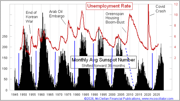
Sunspot Cycle Says Unemployment to Continue Rising
Free Chart In Focus email
Delivered to you every week
Every president wants to have improving jobs numbers, and they all do what they think is necessary and appropriate to achieve that. This includes President Trump, but he is fighting against a more powerful force with a long track record.
It turns out that the sunspot cycle has a very strong correlation to the U.S. unemployment rate (U-3), after one adjustment. This week's chart compares those two sets of data, with the plot of sunspot numbers shifted forward by 3 years. The bottom of each sunspot cycle coincides nicely with a bottom for the unemployment rate 3 years later. And peaks in unemployment tend to echo peaks in the sunspot cycle, with that same 3-year lag time.
The peak month for this current sunspot cycle was in August 2024, so if we count forward exactly 3 years from that we get August 2027 as a projected top for the unemployment rate. It does not always work out exactly to the month, but that is a pretty good rule for planning purposes.
It is also important to understand that sometimes outside events come along which disrupt this nice correlation. Covid was an obvious one, and we cannot really blame this sunspot model for not predicting the 2020 spike in unemployment. There was also an exogenous spike in 1954, after the end of the Korean War brought a slowdown in government defense spending and a rise in unemployment.
Perhaps the biggest example of an exogenous event was when the Fed in the mid-2000s kept interest rates too low for too long, fueling the housing bubble and its eventual collapse. That led to the "Great Financial Crisis (GFC)" in 2008, which did not fit the timing suggested by the sunspot data. But by the late 2010s, the two data plots were back into correlation again.
Whenever I show a comparison of data like this, I always get asked what factor could explain the relationship. Wanting to know that is a natural human tendency. We all want to know the "why". It is not always necessary, though, to get after the "why" if the "is" can be established well enough. We have good data on unemployment rates going back to 1947. Over that period, it is a well-established correlation, except for that handful of exogenous events I mentioned above. It is pretty clear that something is going on here, even if we cannot explain what it is.
Some analysts have hypothesized that sunspots affect the weather, which affects agriculture and thus somehow flows through to unemployment. But the data on sunspots and agricultural production do not match up as well as these data. Another theory is that the charged particles emitted during higher sunspot numbers affect the wiring in human brains, causing us to collectively change our moods. That is an interesting hypothesis, but I know of now way to construct a satisfactory experiment to test that one.
I have personally seen enough evidence of this relationship working for long enough that I can accept its validity even if I cannot explain it. Others may need more evidence. I invite you to ask yourself, for how much more time would it need to keep "working" before you could accept that it is valid?
The last sunspot cycle bottom was 2018-2020, and the period is about 11 years. So we can figure on the next sunspot minimum being due 2029-31, and thus the low for the unemployment rate 3 years later in 2032-35. We do not have the full data for February 2026 yet, but there are already several days in February with zero sunspots. It can be argued that this cycle is quieting down faster than normal. If so, that could matter for improvements in jobs data, but not until the 3-year lag time goes by.
Tom McClellan
Editor, The McClellan Market Report
Nov 21, 2024
Sunspots: A Driver of Unemployment |
Aug 28, 2024
Yield Curve, Unemployment, and Sunspots |
Mar 19, 2015
Global Temps Call for 2015 Yield Bottom |