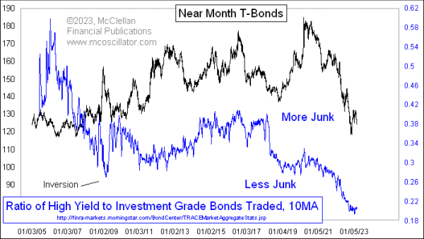
There is Less Junk Than There Used To Be
Free Chart In Focus email
Delivered to you every week
Last week I wrote about the Advance-Decline data for “high yield” bonds, which are reported every day by FINRA at this website. They also report Advance-Decline data on the “investment grade” bonds there, and those data are sort of useful for tracking extremes in that portion of the bond market, which tends to act more like T-Bonds whereas the high yield bonds act more like the stock market.
Since I have those data on each of the categories of bonds, it occurred to me a few years ago to run a comparison of them over time, just to see what information it might provide. That study led to this week’s chart.
What I did was to sum the Advances plus Declines for each bond category (the unchanged numbers are very low, and thus inconsequential). That allowed me to create a daily ratio of how many of each category of bonds trades each day. Those data can be a bit noisy, and so I smoothed those daily ratio data with a 10-day simple moving average to get what you see here.
The first observation is that the ratio has been trending downward over time, meaning that there are comparatively more bonds trading that are rated as investment grade, and fewer that are in the junk category. But I wanted to find a deeper meaning, and so I compared these data first to stock prices, and then to bond prices which is what you see above. The bond comparison was much more interesting.
There is an obvious positive correlation between T-Bond prices and this ratio over time, especially over about the last 10 years or so. At times in the late 2000s (the FINRA data begin in 2005), there were inversions of the two plots, which is strange. The biggest inversion came in December 2008, in the throes of the Great Financial Crisis, as investors sought the greater assurance of a guaranteed “return of investment” in T-Bonds, and as companies were not able to issue junk debt. That was a truly exceptional time in history.
So what can we conclude from this mostly positive correlation the rest of the time? As bond prices fall, yields go up generally. So the desire of investors to reach for yield can go down incrementally, making it harder for companies to issue low grade bonds to finance their operations. That leads those companies to either find other ways of getting the capital they need, or make other arrangements such as mergers, stock issuance, etc.
Right now we are seeing this ratio at the lowest level of the available data (since 2005), meaning that there is just not as much junk debt out there compared to high grade debt as what has been “normal” for the past few years. That does not necessarily mean there are fewer marginal companies out there, whose debt would be rated poorly, but rather that the ability of those companies to issue debt in this bond market environment is just a lot worse.
Tom McClellan
Editor, The McClellan Market Report
Feb 17, 2023
HY Bond A-D Line Showing Liquidity Problem |
Nov 23, 2022
Extreme Reading on McClellan Oscillator for Bonds |
Jan 13, 2022
Bond CEF A-D Line Showing Liquidity Problems |