Three Signs Employment Is Going to Take a Hit
Free Chart In Focus email
Delivered to you every week
Normally the big monthly Employment Situation Report is released on the first Friday of every month, and so normally that would mean March 3. But because of a complicated formula for how such information is released by the Bureau of Labor Statistics, and because February is a short calendar month, this time the release is not until March 10. So we all get an extra week to contemplate what the numbers are going to do.
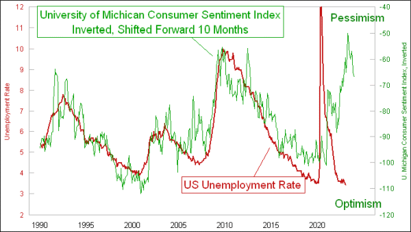
I am expecting that the recent months’ nice numbers for unemployment are going to change very soon (in economic terms). There are three great leading indications that help us know what the lagging data of unemployment are going to do, and this week’s lead chart is the first one. It reveals that changes in consumer confidence precede changes in the unemployment rate by about 10 months. This should mean a rise in the unemployment rate over the next few months, to match the drop in consumer confidence that started more than a year ago. The unemployment rate is currently a little bit late in making that upturn, which likely means that it is going to have to work extra hard to make up for lost time when the turn ultimately comes.
A similar message comes in the next chart from a longer term leading indication. Changes in the inflation rate lead to corresponding changes in the unemployment rate about 2 years later.
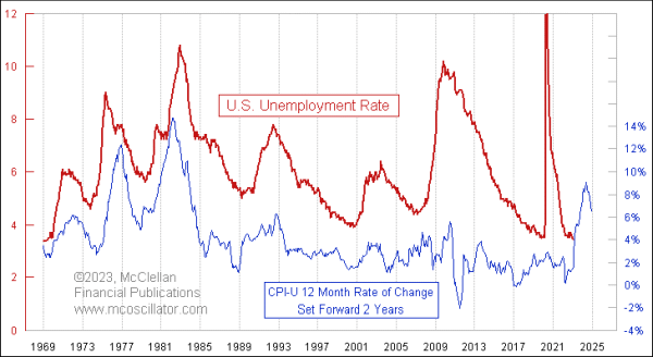
This revelation makes it all the more infuriating that just over 2 years ago, a lot of Federal Reserve officials were bemoaning the inflation rate being too low, below their made-up target of 2%. They actually wanted to get inflation up, oblivious to the reality that this would mean a rise in the unemployment rate, which hurts their “dual mandate”. Sadly, they got their wish.
This model calls for a dramatic rise in the unemployment rate, leading to a peak due in late 2024.
There is one more intermarket relationship that is interesting, and revelatory on this topic. It involves the stock market, and a different way of looking at employment.
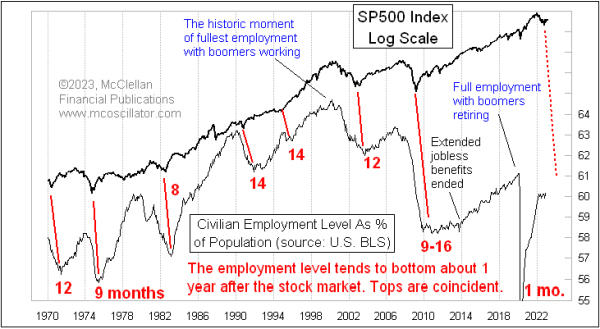
The Employment-Population Ratio counts up every human alive in the U.S. (if you can believe the calculations) and compares that to how many people are working. It factors in not just unemployed people, but also infants, students, retirees, incarcerated, etc. It obviously fluctuates up and down with the economy, but also with changing demographics.
Those changing demographics are not as interesting to contemplate as the economic fluctuations, although demographics obviously do matter in the big picture. Covid threw these data for a loop, sending some people into an early retirement. Even though the official Unemployment Rate (U-3) is at an historic low at 3.4%, we still have not recovered to pre-Covid levels in terms of the Employment-Population Ratio.
The fascinating point addressed in this chart is that the movements in the Employment-Population Ratio tend to lag the movements of the stock market by about a year. This point is especially valid when it comes to stock market declines, which tend to lead to corresponding declines in the Employment-Population Ratio. Most interesting is how the bottoms in the stock market tend to get echoed about 12 months later, on average, in the Employment-Population Ratio.
So if the October 2022 stock market low really is the bottom for that bear market (a point still yet unproven), then we can reliably expect a bottom in the Employment-Population Ratio that would be due in October 2023. That is a little bit hard to contemplate, since we have not even seen a commencement of a decline in that ratio. And if the 2022 bear market actually is not over yet, then that pushes back the end point for the coming decline in the jobs market, which the Fed seems so eager to engineer, thinking that it will somehow help inflation.
As an epilogue, it is worth noting in any discussion about the actual employment or unemployment numbers that the Bureau of Labor Statistics (BLS) is having a harder time gathering and tabulating these data. The employment and nonfarm payrolls numbers come from what is known as the “establishment survey”, which involves asking businesses how many people they employ. The unemployment rate numbers come from the “household survey”, which involves calling people on the phone to ask how many people there are in a house, and how many of them are working, looking for work, etc.
The BLS notes at https://www.bls.gov/osmr/response-rates/ that response rates for both of these surveys have been falling. Here is a BLS chart showing those response rates for various components of the establishment survey:
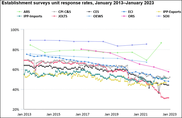
The BLS article linked above has explanations for all of the acronyms listed in the chart, if you wish to explore those differences further. And here is a chart showing the falling response rates for the household survey.
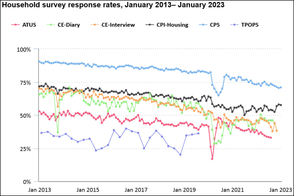
The drop in household response rates makes sense, as more people are migrating away from having landline phones, and as the proliferation of telemarketers leads to fewer people being willing to accept an incoming phone call from a number that they do not recognize. Political polling firms are suffering from these same problems. These lower response rates will understandably affect the numerical accuracy of the data, and so it falls to us to not necessarily believe the precise numbers that get published. But we can still believe generally in the story that they tell about changes of trend direction that come from fluctuations in economic activity.
Tom McClellan
Editor, The McClellan Market Report
Mar 26, 2022
Unemployment Rate Will Turn Up |
May 28, 2020
Unemployment Is Not “Good”, But It Is Bullish |
Mar 08, 2019
Yield Curve Really Does Matter for Unemployment |