Troubling Divergence in HY Bond A-D Line

Free Chart In Focus email
Delivered to you every week
The SP500 keeps on making higher highs, as the effects of QE4 are still being felt in the banking system, and in the stock market. But there is a troubling divergence among some of the most liquidity sensitive investment vehicles, the high yield corporate bonds. Their A-D Line was leading the way higher ever since the December 2018 bottom, but not any more.
High yield bonds trade more like the stock market than like T-Bonds. They are the real canaries in the coal mine, often showing signs of trouble ahead of even the NYSE’s A-D data. This week’s chart shows the daily A-D Line for the high yield bonds as tabulated and reported by FINRA. It saw its peak on Sep. 15, and has not been keeping up with prices since then. That is a big sign of trouble.
QE4 is still underway, even though the FOMC has announced that they are going to be cutting the current $120 billion a month rate by $15 billion each month, a rate which would have QE still keep going for another 8 months if the FOMC keeps to its announced pace of cuts.
The Fed ended QE1 and QE2 suddenly, with pretty awful results for the stock market. If you get an addict hooked and then yank away the addictive substance, the withdrawal symptoms can be pretty bad. They learned their lesson and decided to “taper” QE3 down to nothing, but eventually the illiquidity resulting from taking away those flows brought problems in 2015. So it is a worry for the stock market to have the Fed finally getting around to starting the end of QE4.
Here is a long term chart of the high yield bond A-D Line, which allows us to see what big divergences like this have meant.
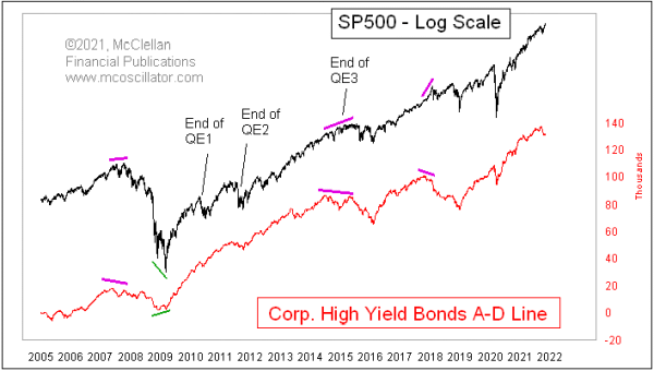
They do not come along that often, but when they do they are worth paying attention to. The 2007 divergence was noteworthy in that it also saw a divergence in the NYSE’s A-D Line (not shown here). But the high yield bond A-D Line’s peak came first, and it was already diverging when the NYSE’s A-D Line divergence had become evident.
This A-D Line gave us no warning about the selloffs resulting from the ending of QE1 and QE2. The Fed’s sudden action was what brought about those sudden selloffs. What this A-D Line did say at those times was that the damage to the high yield market was minimal, and thus the message for liquidity was that things were not so bad. The stock market was able to recover quickly.
By the time QE3 started ending, the damage to the liquidity stream was already evident in the divergence between this A-D Line and the SP500. It took a while for that to come around and hit stock prices, but that hit did come.
Now we are already seeing a divergence developing, and the Fed is only this week announcing that it is going to start tapering QE4. It is a warning of trouble, although it does not tell us exactly when that trouble is going to manifest itself. It is a “condition”, not a “signal”. The wise traders will accept this warning, and use it to help them look for the final moment when the uptrend in prices is at its end. And those same wise traders will also remember that divergences can sometimes rehabilitate themselves.
Tom McClellan
Editor, The McClellan Market Report
Sep 10, 2021
High Yield Bond A-D Line Resolves Divergence |
Jun 06, 2019
High Yield Bonds Back to Bullish Mode |
Sep 14, 2016
McClellan Oscillator for High Yield Bond A-D Data |