VIX Analog Shows Pop Was On Schedule
Free Chart In Focus email
Delivered to you every week
The Jan. 27 VIX pop was fueled by worries over Reddit-inspired traders making a raid upon the established order, which threatened the sanctity of the Wall Street machine and the hedge funds which are part of that machine. Traders feared for the loss of their comfortable and normal situation, and so they bid up the VIX (through the pricing of SP500 options) to a huge number in just a very short time frame.
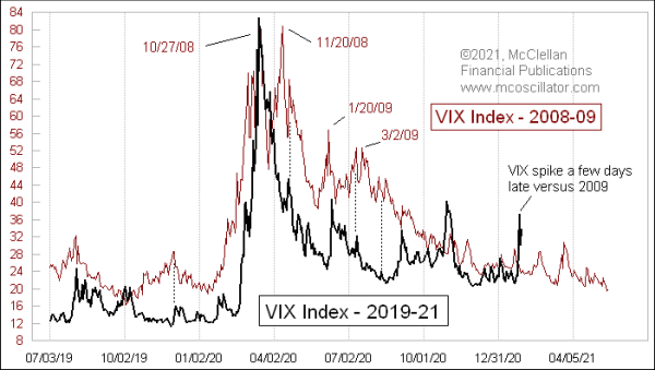
That single episode by itself is not all that surprising. The amazing part is how it fits into the pattern that we have seen before. This week’s chart compares the current pattern in the VIX Index to what unfolded in 2008-09. Most of the time, a price pattern analog involves actual prices of the stock market. This time I am showing a pattern analog in a derivative indicator. The impressive point about this comparison is how it is still working.
In this week’s chart, I have aligned the peaks in the VIX on Oct. 27, 2008 and on March 16, 2020. The supposition is that the climax of each selloff event results in a predictable pattern of aftershocks. That hypothesis seems to be getting borne out by the events since then.
Every price pattern analog I have ever studied or encountered has broken correlation eventually. This one will too, of that I am confident. But it is still working at the moment. I don’t just mean that the VIX level now matches the level at the same time point after the 2008 climax, but also that the arrangement of the minor up and down movements seems to be following the same script. And the Jan. 27 VIX spike up to 37 approximately matches one that occurred 11 years before, part of the pattern of aftershocks from the 2008-09 global financial crisis.
If the script continues to work, then we should expect some momentarily scary-feeling market events to drive the VIX up again in mid-February, and in late March. None of these will actually mark a sky-is-falling end of the world scenario, but it may feel like that at the time.
Tom McClellan
Editor, The McClellan Market Report
Jan 21, 2021
Looking Deeper at the NAAIM Survey Data |
Oct 23, 2020
VIX Open Interest Says This is Not a Top |
Dec 12, 2013
A Review of Analogs |