Volume Data Have Eased One Concern

Free Chart In Focus email
Delivered to you every week
We focus a lot on the Advance-Decline (A-D) data, which is the basis for the McClellan Oscillator and Summation Index plus other indicators. But we also like to watch what the Up Volume (UV) and Down Volume (DV) numbers are doing.
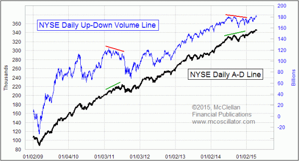
Generally speaking, a new high in the cumulative daily A-D Line is nearly always a bullish indication. When big divergences develop, like what we saw at the 2007 and 2000 tops, it is an issue of great concern.
But we also like to see the volume data confirming what we see in the A-D numbers. In late 2014, it was somewhat concerning to see the daily UV-DV Line not confirming the new highs in the A-D Line. But that conflict has now been resolved, as both have pushed ahead to higher highs.
To create both of these lines, we first find the raw data for Advances, Declines, Up Volume, and Down Volume. Most data providers publish values for these, and most of the providers disagree with each other about what the values are. That is a source of enduring frustration, but it is the environment we are in. For our final data, we use the numbers published by the Wall Street Journal’s web site, and then we reconfirm those each weekend when the weekly issue of Barron’s magazine comes out.
For those wishing to do this themselves, one point about volume numbers is really important to remember. Only about a quarter of all trading volume in NYSE-listed stocks actually trades on the NYSE. Data providers like WSJ often provide two sets of UV and DV numbers, one for NYSE floor trades, and another set of composite volume figures reflecting all trading. For many years, these two data sets were almost identical, but now the electronic trading platforms have taken a much larger share of the business. So starting in 2012, we made a change in our own tracking and reporting to use the composite volume data. For more about that topic, see this article: Time For A Change In How We Track Volume Data
One other point to understand about A-D versus volume data concerns the types of issues which make up the NYSE list. Common stocks only account for about 60% of total issues, and the rest of the list are preferred stocks, bond related closed end funds (CEFs), structured products, rights, warrants, and a few other odds and ends. For the A-D statistics, everyone gets an equal vote, which has sometimes been a source of criticism for the A-D data. Many analysts prefer to use the “common only” A-D data to filter out all of those other types of issues.
My position is that the presumption about those other issues being contaminants to the A-D data is misplaced. And I say this based on actually looking at the data, rather than just making a prejudiced assumption. It can more correctly be said that those other types of issues, and especially the bond CEFs, are much more sensitive to good or bad market liquidity, and so they arguably make the A-D data better by their inclusion.
While the common stocks only make up about 60% of the listed issues, they typically account for around 90-95% of each day’s total share volume. So when we see differences in the behavior of the A-D Line and the UV-DV Line, we are also seeing a difference in the behavior of the different types of listed issues. That difference can be a problem, or at least a source of concern. But now that both the A-D and UV-DV Lines are back in sync again, and making higher highs, that concern has abated.
Tom McClellan
Editor, The McClellan Market Report
Apr 24, 2014
Bond CEF Update: Liquidity Is Plentiful |
Jan 11, 2013
The Disappearing Volume |
Aug 20, 2010
Disagreement Between A-D and Volume Lines |